Violin Plot
- This module teaches how to create violin plots in Seaborn to visualize data distribution and density. You will learn how violin plots combine boxplot elements and help compare categories effectively in Python.
What is a Violin Plot?
A Violin Plot is a combination of:
Box Plot
Kernel Density Plot (Distribution curve)
It shows:
Distribution of data
Probability density
Median & Quartiles
Spread
Shape of dataDistribution + Boxplot Combination
Theory
A violin plot includes:
Inner box → Median & Quartiles
Outer shape → Data distribution (density curve)
It gives more information than a box plot.
Why better than box plot?
Box plot shows only summary statistics.
Violin plot also shows shape of distribution.Example Code
Distribution of Total Bill – Violin Plot
This code creates a violin plot to visualize the distribution of the total_bill column from the tips dataset.
import seaborn as sns
import matplotlib.pyplot as plt

tips = sns.load_dataset("tips")

sns.violinplot(y="total_bill", data=tips)
plt.title("Violin Plot of Total Bill")
plt.show()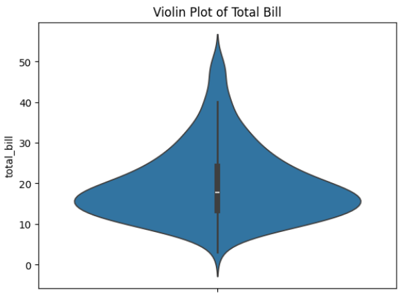
Output Explanation
Middle line → Median
Thick center → High data density
Wide areas → Many observations
Thin areas → Fewer observations
If violin is wide in middle → Most values are concentrated there.
Density Visualization
Theory
Violin plot uses Kernel Density Estimation (KDE) to show:
How data is distributed
Where values are concentrated
Skewness of data
Key Observations
Symmetrical shape → Normal distribution
Long tail → Skewed distribution
Two wide areas → Bimodal distribution
Example — Tip Distribution
Distribution of Tips – Violin Plot
This code creates a violin plot to visualize the distribution of the tip amounts from the tips dataset.
sns.violinplot(y="tip", data=tips)
plt.title("Distribution of Tips")
plt.show()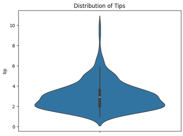
Output Explanation
If top is thin → Few high tips
If bottom is wide → Many small tips
Shape shows spending behavior
Category Comparison
Theory
Violin plot is very powerful for:
Comparing distributions across categories
Understanding variation between groups
Example — Compare Total Bill by Day
Total Bill Distribution by Day – Violin Plot
This code creates a grouped violin plot to visualize how total bill amounts are distributed across different days of the week.
sns.violinplot(x="day", y="total_bill", data=tips)
plt.title("Total Bill Distribution by Day")
plt.show()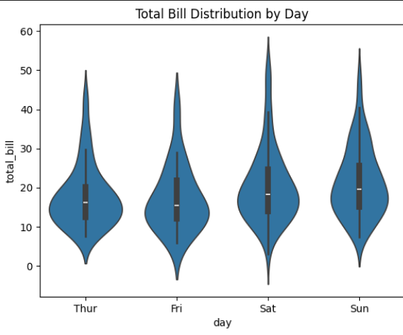
Output Explanation
X-axis → Days
Y-axis → Total Bill
Each violin → Distribution per day
Insights Example:
Saturday may have wider shape → Higher variability
Sunday may show skewness
Friday may have smaller distribution
Example — Multiple Category Comparison (Hue)
Total Bill by Day and Gender hue
This visualization compares the distribution of total bill amounts across different days of the week, separated by gender.
sns.violinplot(x="day", y="total_bill", hue="sex", data=tips)
plt.title("Total Bill by Day and Gender")
plt.show()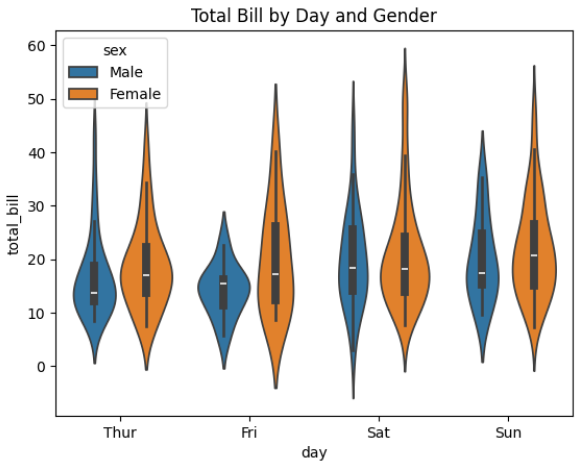
Output Explanation
Two violins per day
Compare Male vs Female spending
Observe:
Who has wider spread
Who has higher median
Distribution differences
Custom Styling
Split Violin
sns.violinplot(x="day", y="total_bill", hue="sex",
              data=tips, split=True)
Shows half violin for each gender.
Horizontal Violin
sns.violinplot(y="day", x="total_bill", data=tips)Show Only Distribution (Remove Inner Box)
sns.violinplot(x="day", y="total_bill", data=tips, inner=None)