KDE Plot
- This module teaches how to create KDE plots in Seaborn to visualize smooth probability density curves. You will learn to compare multiple categories and apply shaded KDE for better data distribution analysis in Python.
What is a KDE Plot?
A KDE Plot (Kernel Density Estimation Plot) is used to:
✔ Show probability density of numerical data
✔ Display smooth distribution curve
✔ Understand data shape
✔ Identify skewness & peaksIt is a smooth version of histogram.
Probability Density Curve
Theory
Unlike histogram (which shows frequency), KDE shows:
Probability density
Important:
Y-axis → Density (not count)
Total area under curve = 1
It estimates how data is distributed across values.
Example Code
KDE Plot of Total Bill
This visualization uses a Kernel Density Estimation (KDE) plot to show the smooth distribution of total bill amounts.
import seaborn as sns
import matplotlib.pyplot as plt
tips = sns.load_dataset("tips")
sns.kdeplot(x="total_bill", data=tips)
plt.title("KDE Plot of Total Bill")
plt.show()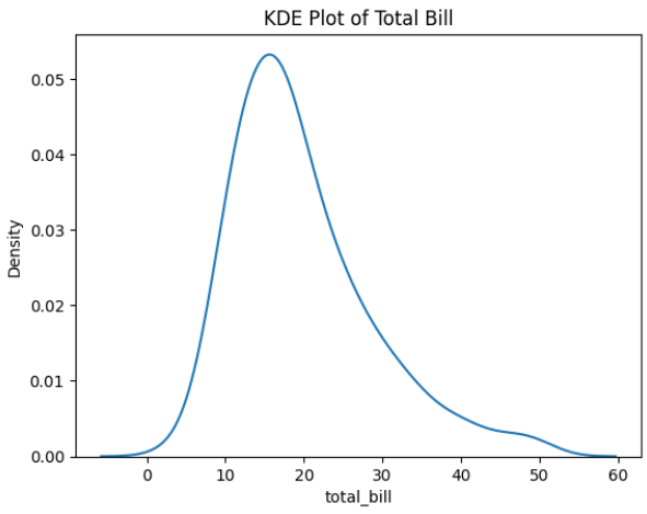
Output Explanation
X-axis → Total Bill
Y-axis → Density
Curve peak → Most common values
Long tail → Skewed data
If curve leans right → Right-skewed distribution.
If symmetric → Normal distribution.Smooth Distribution
Why Smooth?
Histogram:
Bars
Sharp edges
KDE:
Smooth continuous curve
Better visualization of shape
It uses a mathematical technique called Kernel Density Estimation to smooth data.
Example — Tip Distribution
Smooth Distribution of Tips (KDE Plot)
This visualization uses a Kernel Density Estimation (KDE) plot to display a smooth distribution of tip amounts.
sns.kdeplot(x="tip", data=tips)
plt.title("Smooth Distribution of Tips")
plt.show()
What You Observe:
✔ Peaks → Concentration of values
✔ Width → Spread of data
✔ Skewness → Direction of tailComparing Multiple Categories
Why Compare?
To see:
Which group has higher values
Difference in distribution
Spread comparison
Example — Compare by Gender
Total Bill Distribution by Gender (KDE Plot)
This visualization uses a Kernel Density Estimation (KDE) plot to compare the smooth distribution of total bill amounts between male and female customers.
sns.kdeplot(x="total_bill",
           hue="sex",
           data=tips)
plt.title("Total Bill Distribution by Gender")
plt.show()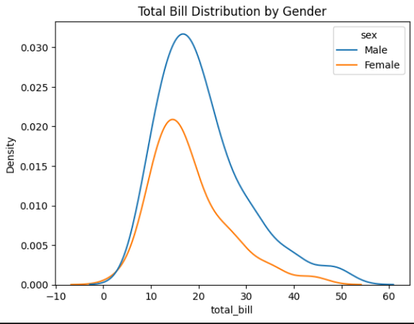
Output Explanation
Two curves → Male & Female
Compare:
Peak height
Curve spread
Skewness
Overlapping area
If one curve shifts right → That group spends more.
Shaded KDE (Filled Curve)
Why Use Fill?
Better visual clarity
More presentation-friendly
Easy comparison
Example — Filled KDE
Shaded KDE Plot of Total Bill
This visualization uses a Kernel Density Estimation (KDE) plot with shading to show the smooth distribution of total bill amounts.
sns.kdeplot(x="total_bill",
           data=tips,
           fill=True)
plt.title("Shaded KDE Plot")
plt.show()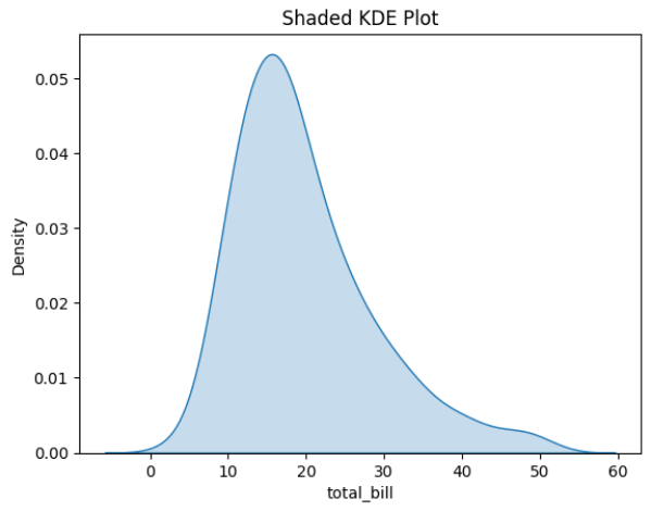
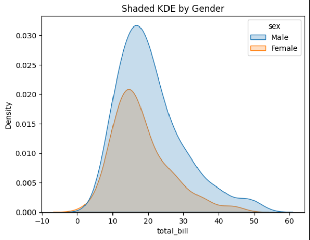
Example — Shaded with Hue
Shaded KDE Plot by Gender
This visualization uses a Kernel Density Estimation (KDE) plot with shading to compare the distribution of total bill amounts between male and female customers.
sns.kdeplot(x="total_bill",
           hue="sex",
           data=tips,
           fill=True)
plt.title("Shaded KDE by Gender")
plt.show()