Heatmap
- This module teaches how to create heatmaps in Seaborn. You will learn to visualize correlation matrices, apply color mapping, add annotations, and use custom color maps to enhance data analysis in Python.
What is a Heatmap?
Theory
A Heatmap is a graphical representation of data where:
✔ Values are shown using colors
✔ Darker/Lighter colors represent magnitude
✔ Used for matrix-type dataMost common use:
Correlation Matrix VisualizationCorrelation Matrix
What is Correlation?
Correlation shows:
Relationship between two numerical variables
Value range: -1 to +1
Example — Correlation Matrix
Correlation Matrix Heatmap
This visualization uses Seaborn’s heatmap to display the correlation between numerical variables in the dataset.
import seaborn as sns
import matplotlib.pyplot as plt

tips = sns.load_dataset("tips")

correlation = tips.corr(numeric_only=True)

sns.heatmap(correlation)
plt.title("Correlation Matrix Heatmap")
plt.show()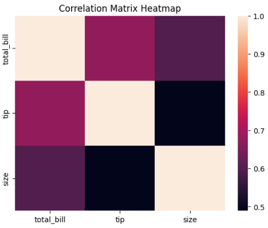
Output Explanation
Rows & Columns → Numerical variables
Each cell → Correlation value
Dark color → Strong relationship
Light color → Weak relationship
Example Insight:
total_bill & tip → Strong positive correlation
size & tip → Moderate correlation
Color Mapping
What is Color Mapping?
Heatmap uses color intensity to represent data values.
Default:
Dark → Higher value
Light → Lower value
Add Color Map
Correlation Matrix Heatmap with Color Map
This visualization uses Seaborn’s heatmap with a color map to display correlations between numerical variables.
sns.heatmap(correlation, cmap="coolwarm")
plt.show()
Popular color maps:
coolwarm
viridis
plasma
YlGnBu
Blues
Center Parameter
sns.heatmap(correlation, cmap="coolwarm", center=0)
Centering at 0 helps highlight:
Positive (red side)
Negative (blue side)
Very useful for correlation matrix.
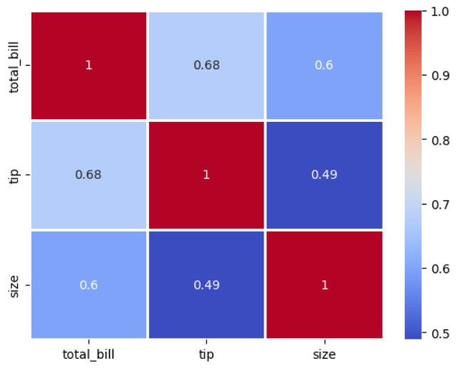
Annotations
What are Annotations?
Annotations display actual values inside each cell.
Add Annotations
Correlation Heatmap with Values (Annotations)
This visualization uses Seaborn’s heatmap with annotations to display correlation values between numerical variables.
sns.heatmap(correlation,
           cmap="coolwarm",
           annot=True)
plt.title("Correlation Heatmap with Values")
plt.show()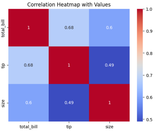
Format Values
Formatted Correlation Heatmap
This visualization uses Seaborn’s heatmap with annotated correlation values formatted to two decimal places.
sns.heatmap(correlation,
           cmap="coolwarm",
           annot=True,
           fmt=".2f")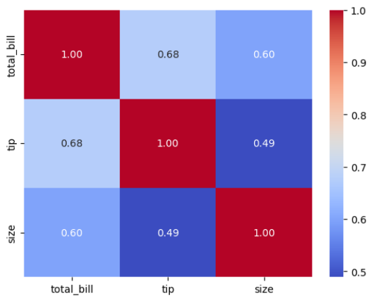
.2f → Shows 2 decimal places.
Custom Color Maps
Change Color Theme
Correlation Heatmap with Custom Color Theme
This visualization uses Seaborn’s heatmap with a custom color palette to display correlations between numerical variables.
sns.heatmap(correlation,
           cmap="YlGnBu",
           annot=True)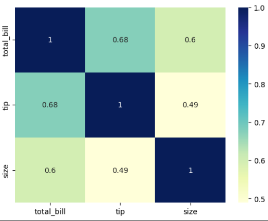
Reverse Color Map
Correlation Heatmap with Reversed Color Map
This visualization uses Seaborn’s heatmap with a reversed color palette to display correlations between numerical variables.
sns.heatmap(correlation,
           cmap="coolwarm_r",
           annot=True)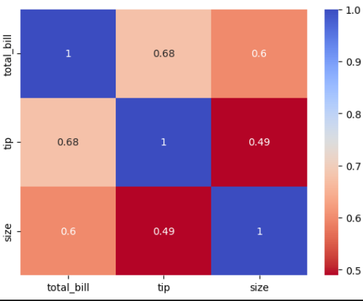
_r → Reverses color scheme.
Remove Color Bar
Correlation Heatmap without Color Bar
This visualization uses Seaborn’s heatmap to display correlations between numerical variables without showing the color bar.
sns.heatmap(correlation,
           cmap="coolwarm",
           annot=True,
           cbar=False)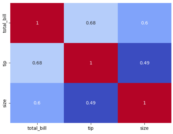
Add Line Separators
Correlation Heatmap with Line Separators
This visualization uses Seaborn’s heatmap to display correlations between numerical variables with grid lines between cells.
sns.heatmap(correlation,
           cmap="coolwarm",
           annot=True,
           linewidths=1)