Line Chart
-
This module teaches how to create line charts in Matplotlib using
plt.plot(). You will learn to plot single and multiple lines, customize markers and linestyles, change colors, and add legends for better data visualization.
Line Chart
Used to show trends over time.
Use Case:
Monthly sales
Stock prices
Website traffic
Example:
Monthly Sales Trend Line Chart
This code creates a line chart using Matplotlib to visualize monthly sales data. The x-axis represents the months (Jan–May), and the y-axis represents sales amounts in rupees (₹).
import matplotlib.pyplot as plt
# Sample data
months = ['Jan', 'Feb', 'Mar', 'Apr', 'May']
sales = [20000, 25000, 18000, 22000, 26000]
# Create line chart
plt.figure(figsize=(8,5))
plt.plot(months, sales, marker='o', color='blue', linestyle='-', linewidth=2)
plt.title("Monthly Sales Trend")
plt.xlabel("Month")
plt.ylabel("Sales (₹)")
plt.grid(True)
plt.tight_layout()
# Show plot
plt.show()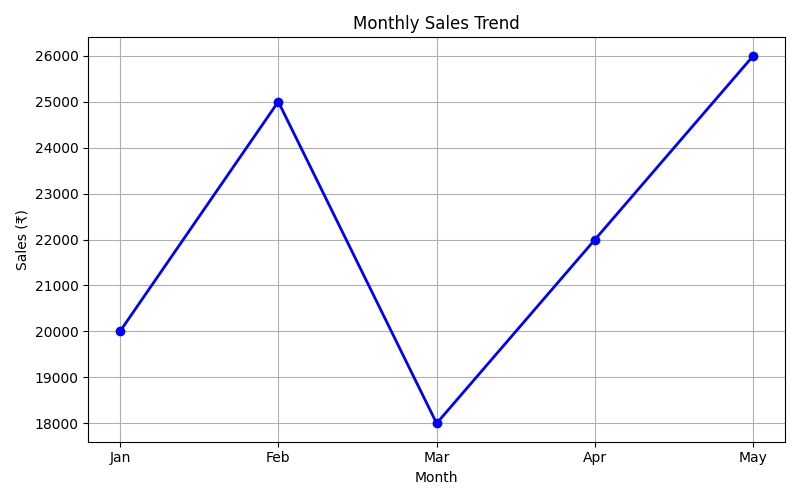
Line Styles
You can choose any of these styles:
Example:
Line Plot with Dotted Linestyle
This code creates a simple line plot using Matplotlib and applies a dotted line style using the linestyle='dotted' parameter.
import matplotlib.pyplot as plt
import numpy as np

ypoints = np.array([3, 8, 1, 10])

plt.plot(ypoints, linestyle = 'dotted')
plt.show()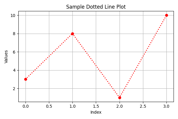
Example:
Line Plot with Dashed Linestyle
This code plots a line chart using Matplotlib and changes the line style to dashed using linestyle='dashed'.
plt.plot(ypoints, linestyle = 'dashed')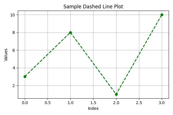
Line Color
You can use the keyword argument color or the shorter c to set the color of the line:
Line Plot with Red Color
This code creates a simple line chart using Matplotlib and changes the line color to red using the parameter color='r'.
import matplotlib.pyplot as plt
import numpy as np

ypoints = np.array([3, 8, 1, 10])

plt.plot(ypoints, color = 'r')
plt.show()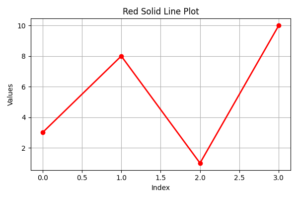
Line Width
You can use the keyword argument linewidth or the shorter lw to change the width of the line.
The value is a floating number, in points:
Line Plot with Increased Line Width
This code creates a line chart using Matplotlib and increases the thickness of the line using the linewidth parameter.
import matplotlib.pyplot as plt
import numpy as np

ypoints = np.array([3, 8, 1, 10])

plt.plot(ypoints, linewidth = '20.5')
plt.show()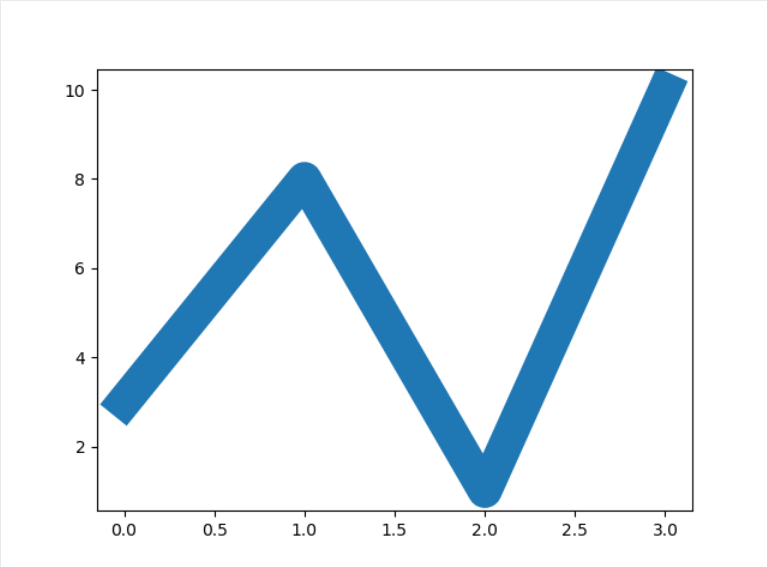
Multiple Lines
You can plot as many lines as you like by simply adding more plt.plot() functions:
Plotting Multiple Lines on the Same Chart
This code plots two different datasets (y1 and y2) on the same graph using Matplotlib.
import matplotlib.pyplot as plt
import numpy as np

y1 = np.array([3, 8, 1, 10])
y2 = np.array([6, 2, 7, 11])

plt.plot(y1)
plt.plot(y2)

plt.show()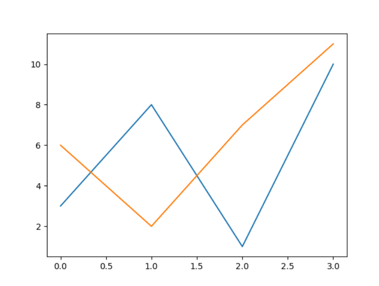
You can also plot many lines by adding the points for the x- and y-axis for each line in the same plt.plot() function.
(In the examples above we only specified the points on the y-axis, meaning that the points on the x-axis got the the default values (0, 1, 2, 3).)
The x- and y- values come in pairs:
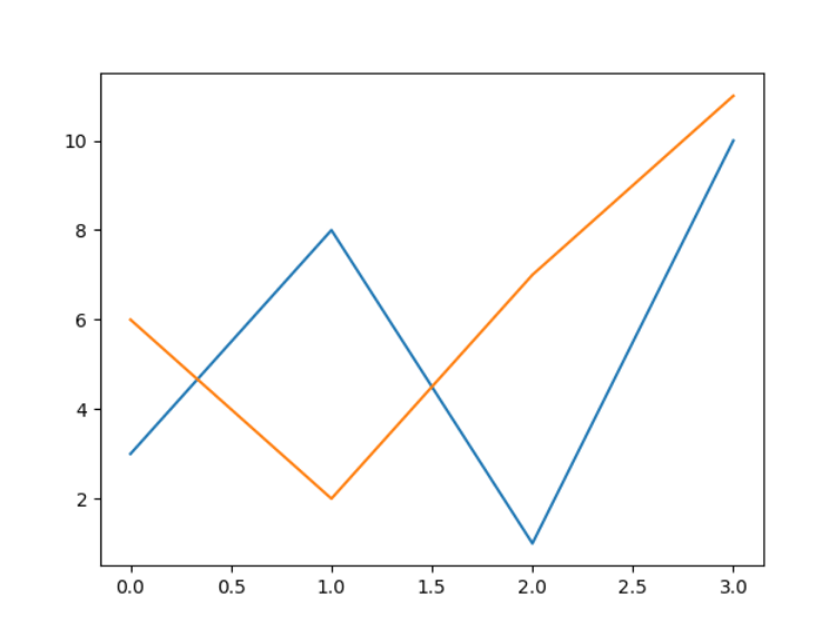
Plotting Two Lines with Explicit X and Y Coordinates
This code plots two different lines on the same graph by explicitly providing both x-axis and y-axis values for each dataset.
import matplotlib.pyplot as plt
import numpy as np

x1 = np.array([0, 1, 2, 3])
y1 = np.array([3, 8, 1, 10])
x2 = np.array([0, 1, 2, 3])
y2 = np.array([6, 2, 7, 11])

plt.plot(x1, y1, x2, y2)
plt.show()