Pie Chart
-
This module teaches how to create and customize pie charts in Matplotlib using
plt.pie(). You will learn to add percentage labels, apply explode effects, use custom colors, and adjust shadow and start angle for better visualization.
Pie Chart
Shows proportion or percentage distribution.
Use Case:
Market share
Expense distribution
With Pyplot, you can use the pie() function to draw pie charts:
Simple Pie Chart Representation
This code creates a basic pie chart using Matplotlib to represent proportional data.
import matplotlib.pyplot as plt
import numpy as np

y = np.array([35, 25, 25, 15])

plt.pie(y)
plt.show()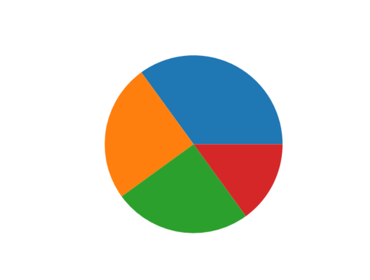
Labels
Add labels to the pie chart with the labels parameter.
The labels parameter must be an array with one label for each wedge:
Pie Chart with Custom Category Labels
This code creates a pie chart and adds custom labels to each slice using the labels parameter.
import matplotlib.pyplot as plt
import numpy as np

y = np.array([35, 25, 25, 15])
mylabels = ["Apples", "Bananas", "Cherries", "Dates"]

plt.pie(y, labels = mylabels)
plt.show() 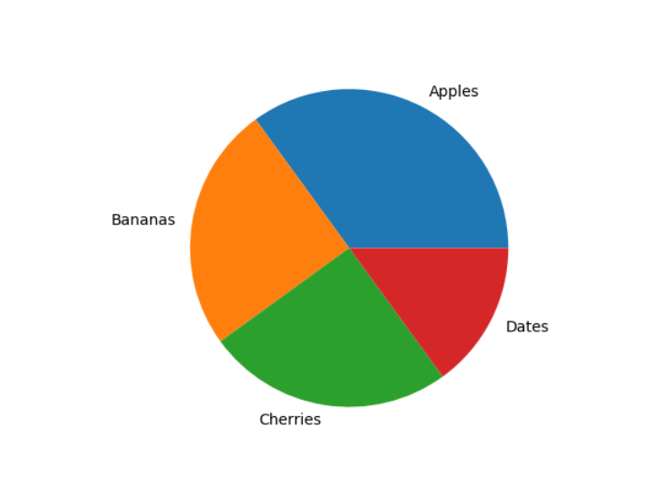
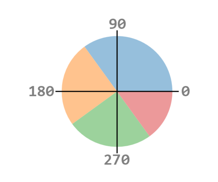
Example
Start the first wedge at 90 degrees:
Pie Chart with Start Angle Rotation
This code creates a pie chart and rotates the starting position of the first slice using the startangle parameter.
import matplotlib.pyplot as plt
import numpy as np

y = np.array([35, 25, 25, 15])
mylabels = ["Apples", "Bananas", "Cherries", "Dates"]

plt.pie(y, labels = mylabels, startangle = 90)
plt.show() 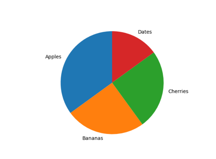
Explode Effect:
Maybe you want one of the wedges to stand out? The explode parameter allows you to do that.
The explode parameter, if specified, and not None, must be an array with one value for each wedge.
Each value represents how far from the center each wedge is displayed:
Pie Chart Highlighting a Slice (Explode Effect)
This code creates a pie chart and highlights one slice using the explode parameter.
import matplotlib.pyplot as plt
import numpy as np

y = np.array([35, 25, 25, 15])
mylabels = ["Apples", "Bananas", "Cherries", "Dates"]
myexplode = [0.2, 0, 0, 0]

plt.pie(y, labels = mylabels, explode = myexplode)
plt.show() 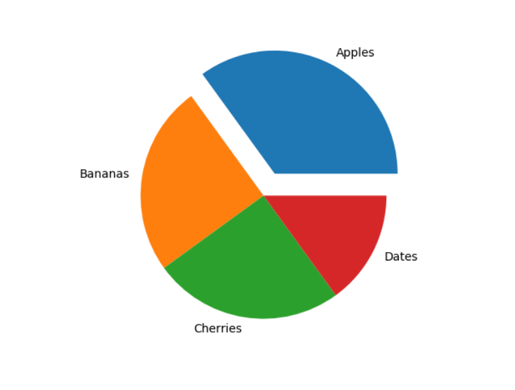
Shadow Effect:
Add a shadow to the pie chart by setting the shadows parameter to True:
Pie Chart with Highlighted Slice and Shadow
This code creates a pie chart with an exploded slice and adds a shadow effect for better visual appearance.
import matplotlib.pyplot as plt
import numpy as np

y = np.array([35, 25, 25, 15])
mylabels = ["Apples", "Bananas", "Cherries", "Dates"]
myexplode = [0.2, 0, 0, 0]

plt.pie(y, labels = mylabels, explode = myexplode, shadow = True)
plt.show() 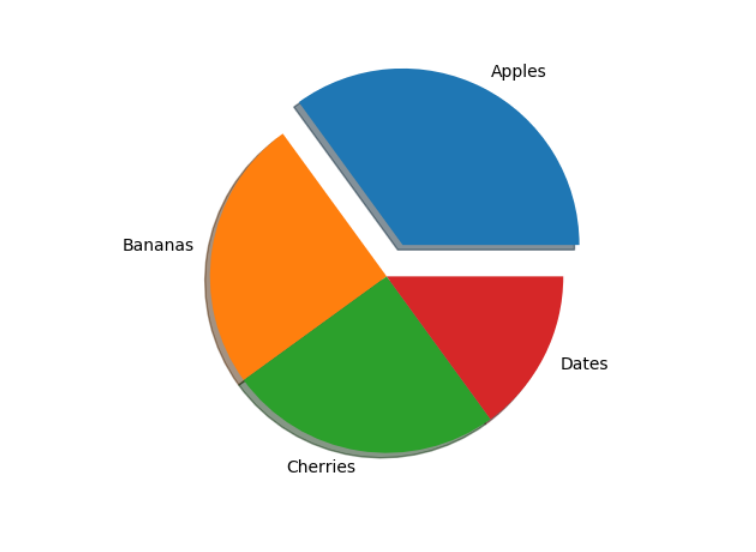
Custom Colors:
You can set the color of each wedge with the colors parameter.
The colors parameter, if specified, must be an array with one value for each wedge:
Pie Chart with Custom Slice Colors
This code creates a pie chart and assigns custom colors to each slice using the colors parameter.
import matplotlib.pyplot as plt
import numpy as np

y = np.array([35, 25, 25, 15])
mylabels = ["Apples", "Bananas", "Cherries", "Dates"]
mycolors = ["black", "hotpink", "b", "#4CAF50"]

plt.pie(y, labels = mylabels, colors = mycolors)
plt.show() 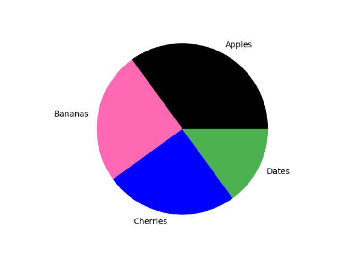
You can use Hexadecimal color values, any of the 140 supported color names, or one of these shortcuts:
'r' - Red
'g' - Green
'b' - Blue
'c' - Cyan
'm' - Magenta
'y' - Yellow
'k' - Black
'w' - WhiteLegend
To add a list of explanation for each wedge, use the legend() function:
Example
Add a legend:
Pie Chart with Labels and Legend
This code creates a pie chart and adds a legend using the plt.legend() function.
import matplotlib.pyplot as plt
import numpy as np
y = np.array([35, 25, 25, 15])
mylabels = ["Apples", "Bananas", "Cherries", "Dates"]
plt.pie(y, labels = mylabels)
plt.legend()
plt.show() 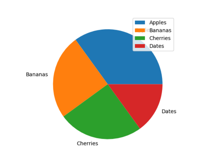
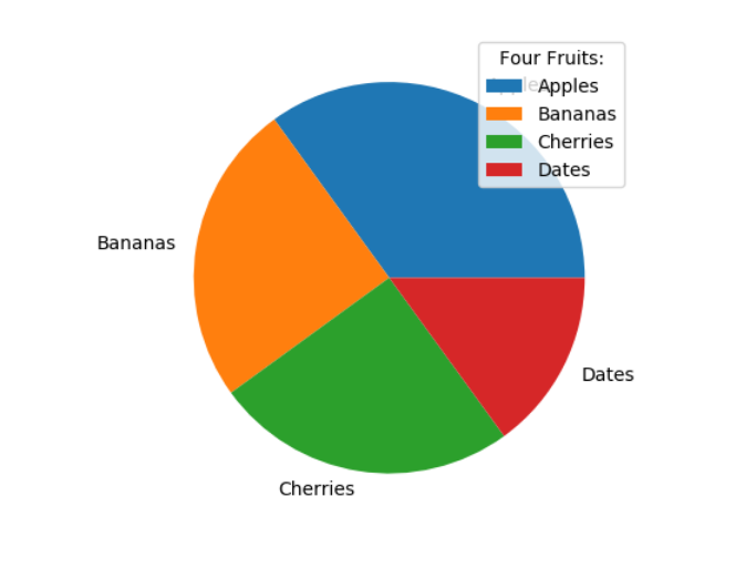
Legend With Header
To add a header to the legend, add the title parameter to the legend function.
Example:
Add a legend with a header:
Pie Chart with Customized Legend Title
This code creates a pie chart and adds a legend with a custom title using the title parameter inside plt.legend().
import matplotlib.pyplot as plt
import numpy as np
y = np.array([35, 25, 25, 15])
mylabels = ["Apples", "Bananas", "Cherries", "Dates"]
plt.pie(y, labels = mylabels)
plt.legend(title = "Four Fruits:")
plt.show()