Distribution Plot
- This module teaches how to create distribution plots in Seaborn. You will learn figure-level plotting, combine histogram with KDE, use Facet Grid for row/column analysis, and perform multi-category distribution comparisons in Python.
What is a Figure-Level Distribution Plot?
Theory
In Seaborn, there are two types of functions:
displot() is a figure-level function.
It creates its own figure and supports:✔ Histogram
✔ KDE
✔ Facet Grid
✔ Multiple categoriesBasic Example
Distribution of Total Bill (Displot)
This visualization uses Seaborn’s displot to display the distribution of total bill amounts.
import seaborn as sns
import matplotlib.pyplot as plt
tips = sns.load_dataset("tips")
sns.displot(x="total_bill", data=tips)
plt.show()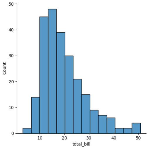
Output Explanation
X-axis → total_bill
Y-axis → frequency
Shows distribution of bills
Combining Histogram + KDE
Theory
We can combine:
✔ Histogram (bars)
✔ KDE (smooth curve)This gives:
Frequency
Smooth distribution shape
Example
Total Bill Distribution with KDE (Displot)
This visualization uses Seaborn’s displot to show the distribution of total bill amounts along with a Kernel Density Estimate (KDE) curve.
sns.displot(x="total_bill",
           data=tips,
           kde=True)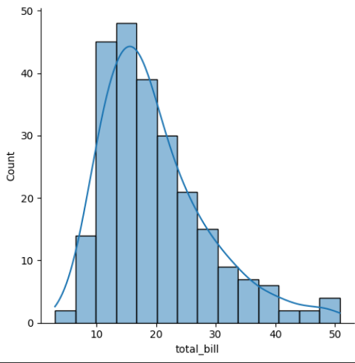
Output Explanation
Bars → Frequency
Curve → Density
Helps understand:
Peaks
Skewness
Spread
Density Instead of Count
sns.displot(x="total_bill",
           data=tips,
           stat="density",
           kde=True)
Y-axis → Density instead of frequency.
Facet Grid (row, col)
What is Facet Grid?
Facet Grid splits data into multiple subplots based on categories.
Very powerful for:
✔ Multi-category comparison
✔ Subgroup analysis
✔ Business reportsExample — Row Facet
Total Bill Distribution by Gender (Facet Displot with KDE)
This visualization uses Seaborn’s displot with the row parameter to create separate distributions of total bill amounts for each gender.
sns.displot(x="total_bill",
           data=tips,
           row="sex",
           kde=True)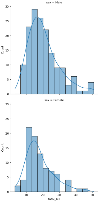
Creates separate plots for:
Male
Female
Example — Column Facet
Total Bill Distribution by Day (Facet Displot with KDE)
This visualization uses Seaborn’s displot with the col parameter to create separate distributions of total bill amounts for each day of the week.
sns.displot(x="total_bill",
           data=tips,
           col="day",
           kde=True)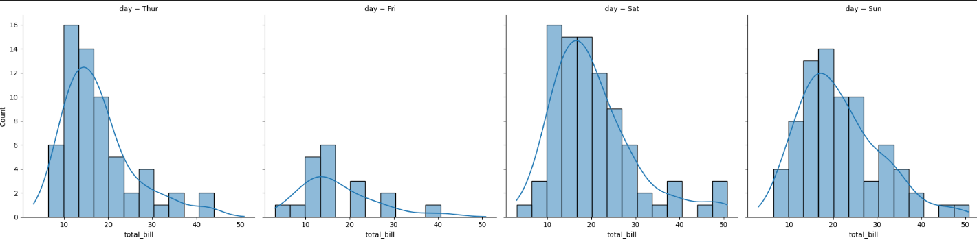
Separate distribution for each day.
Example — Row + Column
Total Bill Distribution by Gender and Smoking Status (Facet Displot with KDE)
This visualization uses Seaborn’s displot with both row and col parameters to create a grid of distributions for total bill amounts.
sns.displot(x="total_bill",
           data=tips,
           row="sex",
           col="smoker",
           kde=True)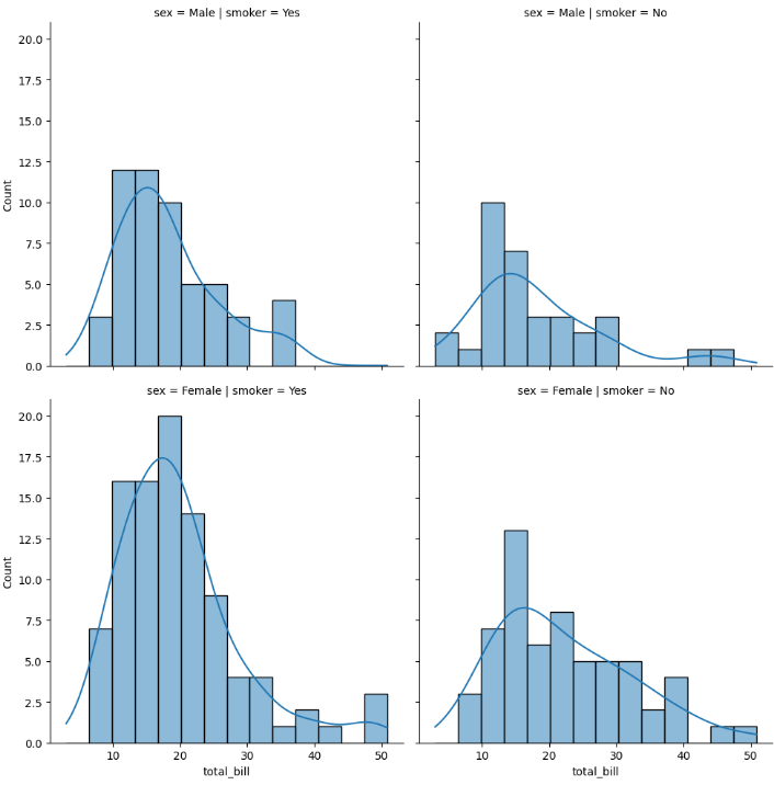
Creates grid:
Male Smoker
Male Non-Smoker
Female Smoker
Female Non-Smoker
Output Explanation
Each subplot shows distribution for a specific category combination.
This is called Multi-Dimensional Analysis.
Multi-category Analysis
Using Hue
Total Bill Distribution by Gender (Displot with Hue & KDE)
This visualization uses Seaborn’s displot to show the distribution of total bill amounts, separated by gender using the hue parameter.
sns.displot(x="total_bill",
           hue="sex",
           data=tips,
           kde=True)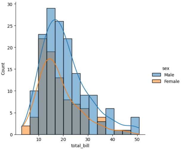
Shows overlapping distributions in same plot.
Using Multiple Option
Stacked Histogram of Total Bill by Gender
This visualization uses Seaborn’s displot to display a stacked histogram of total bill amounts, separated by gender.
sns.displot(x="total_bill",
           hue="sex",
           data=tips,
           multiple="stack")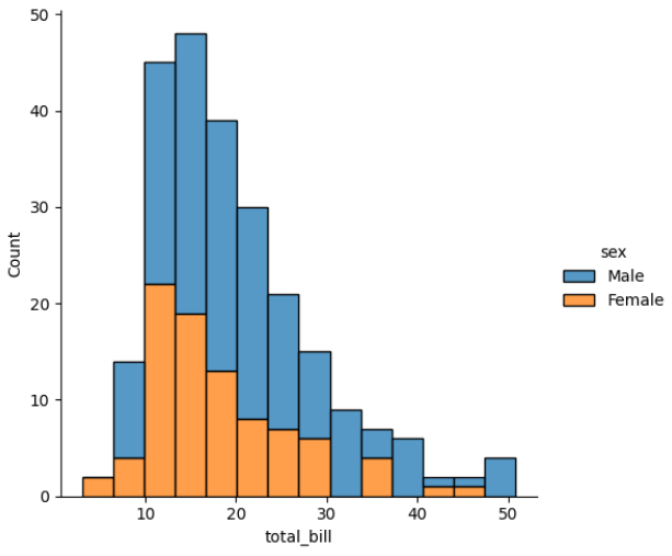
Options:
layer (default)
stack
dodge
fill
Types of Distribution in displot()
We can change kind parameter:
Histogram
sns.displot(x="total_bill", data=tips, kind="hist")KDE
sns.displot(x="total_bill", data=tips, kind="kde")ECDF
sns.displot(x="total_bill", data=tips, kind="ecdf")