Line Plot
- This module explains how to create and customize line plots in Seaborn. You will learn about confidence intervals, plotting multiple lines, and applying styling options for clear and effective data visualization.
Creating Line Plot
Theory
Used for time series data
Shows increasing / decreasing trends
Helps identify patterns
Key Components:
x → Independent variable (time, months, etc.)
y → Dependent variable (sales, marks, growth, etc.)
plt.plot() → Draws line
plt.grid() → Adds grid
plt.title() → Title
Example image shown above: Basic Line Plot
Monthly Sales – Basic Line Plot
This code creates a line plot using Seaborn to visualize the trend of sales over months.
import matplotlib.pyplot as plt
import numpy as np

# Sample Data
np.random.seed(10)
import seaborn as sns
import matplotlib.pyplot as plt
import numpy as np
import pandas as pd
# Data
x = np.arange(1, 11)
y = np.array([4, 6, 5, 7, 6, 8, 10, 9, 11, 13])

# DataFrame banana (Seaborn ke liye better practice)
df = pd.DataFrame({
    "Months": x,
    "Sales": y
})
# Plot
plt.figure()
sns.lineplot(x="Months", y="Sales", data=df)
plt.title("Basic Line Plot")
plt.xlabel("X Values")
plt.ylabel("Y Values")
plt.grid(True)
plt.show()
Confidence Interval (CI)
Theory
Confidence Interval shows:
Possible variation range
Uncertainty in data
Upper & lower bound
We use:
plt.fill_between(x, lower, upper)
Why Important?
In real-world:
Sales forecast range
Temperature prediction range
Statistical analysis
Example image above: Line Plot with Confidence Interval
Shaded area = uncertainty range.
Monthly Sales – Line Plot with Confidence Interval
This code creates a line plot using Seaborn and includes a confidence interval (CI) around the line to show the uncertainty or variability of the data.
import seaborn as sns
import matplotlib.pyplot as plt
import numpy as np
import pandas as pd
# Sample Data
np.random.seed(10)
x = np.arange(1, 11)
y = np.array([4, 6, 5, 7, 6, 8, 10, 9, 11, 13])
df = pd.DataFrame({
    "Months": x,
    "Sales": y
})
plt.figure()
sns.lineplot(
    x="Months",
    y="Sales",
    data=df,
    errorbar="ci"   # Confidence Interval
)
plt.title("Line Plot with Confidence Interval")
plt.xlabel("X Values")
plt.ylabel("Y Values")
plt.grid(True)
plt.show()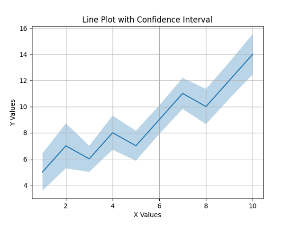
Multiple Lines
Theory
Used when:
Comparing two or more categories
Comparing years
Comparing products
We call plt.plot() multiple times.
Example:
Product A vs Product B
2024 vs 2025 sales
Example image above: Multiple Line Plot
Two lines = two datasets comparison.
Monthly Sales – Comparing Two Sales Trends
This code creates a line plot with two separate lines using Seaborn, allowing comparison between two sales trends over the same months.
import seaborn as sns
import matplotlib.pyplot as plt
import numpy as np
import pandas as pd

# Sample Data
np.random.seed(10)
x = np.arange(1, 11)
y = np.array([4, 6, 5, 7, 6, 8, 10, 9, 11, 13])
y2 = y + np.random.randint(-2, 3, size=len(y))

# DataFrame ko long format me convert karna
df = pd.DataFrame({
    "Months": list(x) * 2,
    "Sales": list(y) + list(y2),
    "Type": ["Sales 1"] * len(y) + ["Sales 2"] * len(y2)
})

# Plot
plt.figure()
sns.lineplot(x="Months", y="Sales", hue="Type", data=df)
plt.title("Multiple Line Plot")
plt.xlabel("X Values")
plt.ylabel("Y Values")
plt.grid(True)
plt.show()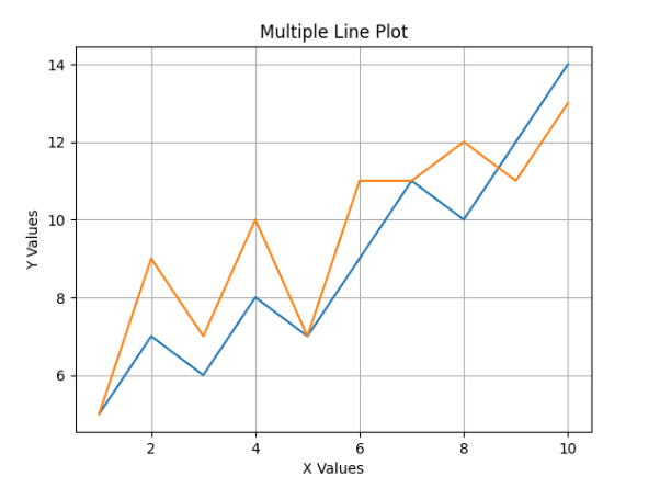
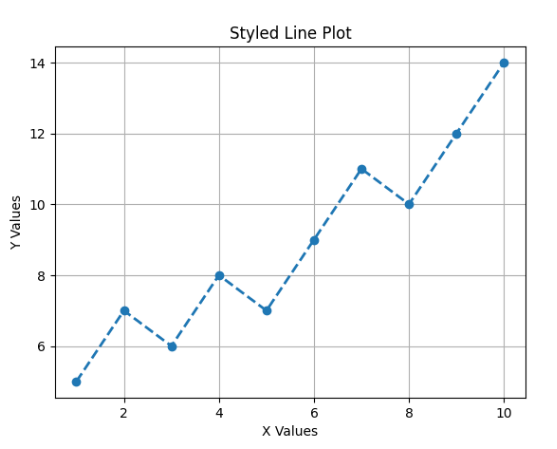
Styling & Customization
Theory
Important customization options:
Example:
plt.plot(x, y, linestyle="--", marker="o", linewidth=2)
Example image above: Styled Line Plot
Monthly Sales – Line Plot with Custom Style
This code creates a line plot using Seaborn and applies custom styling such as dashed lines, markers, and line width.
import seaborn as sns
import matplotlib.pyplot as plt
import numpy as np
import pandas as pd

# Sample Data
np.random.seed(10)
x = np.arange(1, 11)
y = np.array([4, 6, 5, 7, 6, 8, 10, 9, 11, 13])

# DataFrame
df = pd.DataFrame({
    "Months": x,
    "Sales": y
})

plt.figure()
sns.lineplot(
    x="Months",
    y="Sales",
    data=df,
    linestyle="--",
    marker="o",
    linewidth=2
)

plt.title("Styled Line Plot")
plt.xlabel("X Values")
plt.ylabel("Y Values")
plt.grid(True)
plt.show()