Strip Plot
- This module explains how to create strip plots in Seaborn to visualize individual data points. You will learn about the jitter concept to reduce overlap and how to combine strip plots with boxplots for better categorical data analysis in Python.
What is a Strip Plot?
A Strip Plot is used to display:
Individual data points
Distribution of categorical data
Spread of observationsUnlike box plot or violin plot, it shows actual raw data points.
Individual Data Points
Theory
Strip plot:
Plots each observation separately
Useful when dataset is small to medium
Helps identify:
Clusters
Spread
Outliers
Overlapping points
Example Code
Total Bill by Day (Strip Plot)
This visualization displays individual total bill values for each day of the week using a strip plot.
import seaborn as sns
import matplotlib.pyplot as plt

tips = sns.load_dataset("tips")

sns.stripplot(x="day", y="total_bill", data=tips)
plt.title("Total Bill by Day (Strip Plot)")
plt.show()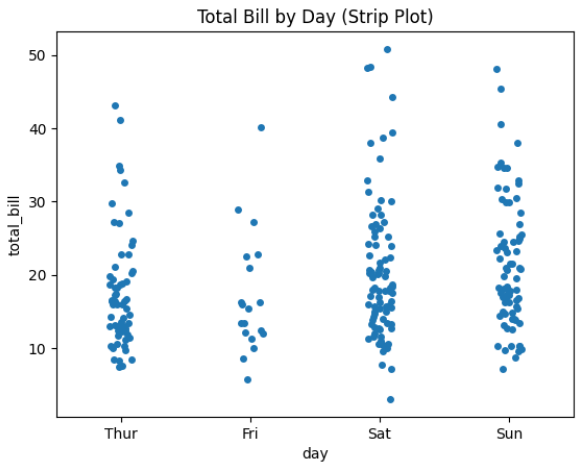
Output Explanation
X-axis → Days
Y-axis → Total Bill
Each dot → One customer bill
If many dots are near 20 → Most bills are around 20.
If some dots are very high → Possible outliers.Jitter Concept
Problem Without Jitter
When multiple data points have same value:
They overlap
Hard to see distribution
What is Jitter?
Jitter adds small random noise horizontally to spread points.
Prevents overlapping
Makes visualization clearerExample — With Jitter
Strip Plot with Jitter
This visualization shows individual total bill values for each day, with jitter enabled to improve clarity.
sns.stripplot(x="day", y="total_bill", data=tips, jitter=True)
plt.title("Strip Plot with Jitter")
plt.show()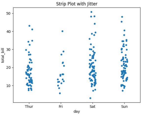
Output Explanation
Points slightly spread horizontally
Easier to see density
No overlapping confusion
Adjust Jitter Size
sns.stripplot(x="day", y="total_bill", data=tips, jitter=0.3)
Higher value → More spread
Lower value → Less spreadCategory Comparison
Strip plot works very well for comparing:
Spending by gender
Sales by region
Scores by class
Example — Using Hue
Total Bill by Day and Gender (Strip Plot with Hue)
This visualization displays individual total bill values for each day of the week, separated by gender using the hue parameter.
sns.stripplot(x="day", y="total_bill",
             hue="sex",
             data=tips,
             jitter=True)
plt.title("Total Bill by Day and Gender")
plt.show()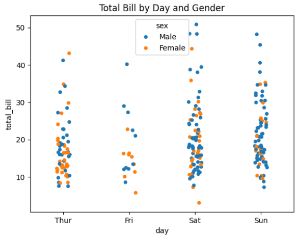
Output Explanation
Different colors → Male & Female
Compare distribution visually
See which group spends more
Combining with Boxplot
Why Combine?
Box plot → Shows summary (median, quartiles)
Strip plot → Shows actual data points
Together → Complete visualization.
Example — Boxplot + Stripplot
Boxplot with Stripplot (Combined Visualization)
This visualization combines a box plot and a strip plot to give both statistical summary and individual data points for total bills across different days.
sns.boxplot(x="day", y="total_bill", data=tips)
sns.stripplot(x="day", y="total_bill",
             data=tips,
             color="black",
             jitter=True)
plt.title("Boxplot with Stripplot")
plt.show()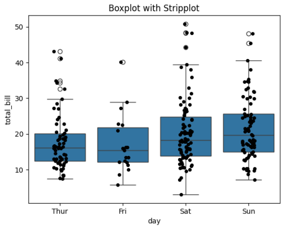
Output Explanation
Box → Statistical summary
Dots → Individual observations
Very useful for presentations
This gives both:
Distribution summary
Raw data visibilityCustom Styling
Horizontal Strip Plot
sns.stripplot(y="day", x="total_bill", data=tips, jitter=True)Adjust Point Size
sns.stripplot(x="day", y="total_bill", data=tips, size=6)Adjust Transparency
sns.stripplot(x="day", y="total_bill", data=tips, alpha=0.5)