Scatter Plot
- This module teaches how to create scatter plots in Seaborn and compare multiple variables using hue, size, and style parameters. You will also learn various customization options to enhance data visualization clarity.
What is a Scatter Plot?
A Scatter Plot is used to show the relationship between two numerical variables.
Each point represents one observation in the dataset.In Seaborn, scatter plots are created using:
Creating a Basic Scatter Plot
Theory
x → Independent variable
y → Dependent variable
data → Dataset (usually a DataFrame)
It helps to:
Identify correlation
Detect outliers
Understand trends
Example
Total Bill vs Tip – Basic Seaborn Scatter Plot
This code creates a simple scatter plot using Seaborn to visualize the relationship between the total bill amount and the tip amount from the built-in tips dataset.
import seaborn as sns
import matplotlib.pyplot as plt

# Load built-in dataset
df = sns.load_dataset("tips")

# Basic scatter plot
sns.scatterplot(x="total_bill", y="tip", data=df)

plt.title("Total Bill vs Tip")
plt.show()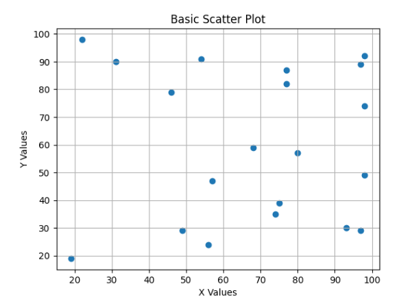
What it shows:
Each dot = one customer
X-axis = total bill
Y-axis = tip amount
Helps check if tip increases with total bill
Using hue (Color Variation)
Theory
hue adds a third variable using different colors.
Used when:
Comparing categories
Grouping data visually
Example
Total Bill vs Tip – Colored by Gender hue
This code creates a scatter plot using Seaborn and colors the data points based on gender using the hue parameter.
sns.scatterplot(x="total_bill", y="tip", hue="sex", data=df)
plt.title("Total Bill vs Tip (Colored by Gender)")
plt.show()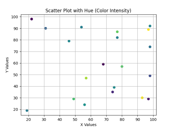
What happens:
Different colors for Male and Female
Easy category comparison
Using size (Bubble Plot)
Theory
size represents another variable using marker size.
Used when:
Showing magnitude difference
Adding numerical comparison
Example
Total Bill vs Tip – Bubble Plot (Size by Group Size)
This code creates a bubble scatter plot using Seaborn where the size of each point represents the number of people at the table.
sns.scatterplot(x="total_bill", y="tip", size="size", data=df)
plt.title("Bubble Plot (Size = Number of People)")
plt.show()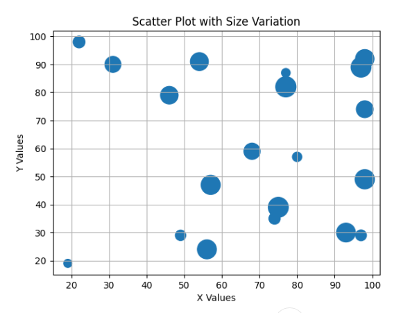
What happens:
Bigger circle = More people at table
Adds extra dimension to visualization
Using style (Marker Style Change)
Theory
style changes marker shapes based on category.
Used when:
Comparing groups clearly
Black & white print friendly graphs
Example
Total Bill vs Tip – Marker Style by Time (Lunch/Dinner)
This code creates a scatter plot using Seaborn and changes the marker style based on the time of the meal (Lunch or Dinner) using the style parameter.
sns.scatterplot(x="total_bill", y="tip", style="time", data=df)
plt.title("Marker Style by Time (Lunch/Dinner)")
plt.show()
What happens:
Different shapes for Lunch and Dinner
Easy comparison without color
Multiple Variable Comparison (hue + size + style)
Theory
You can combine:
hue → Color
size → Marker size
style → Marker shape
This creates a multi-dimensional visualization.
Example
Total Bill vs Tip – Multi-Dimensional Visualization
This code creates an advanced scatter plot using Seaborn that visualizes multiple variables from the dataset in a single chart.
sns.scatterplot(
    x="total_bill",
    y="tip",
    hue="sex",
    size="size",
    style="time",
    data=df
)
plt.title("Multi-Variable Scatter Plot")
plt.show()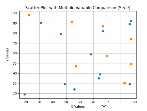
Customization Options
Add Transparency (alpha)
sns.scatterplot(x="total_bill", y="tip", data=df, alpha=0.6)Change Color Palette
sns.scatterplot(x="total_bill", y="tip", hue="day", data=df, palette="Set2")- Add Grid
plt.grid(True)