Histogram Plot
- This module explains how to create histograms in Seaborn to analyze data distribution. You will learn about the bins concept, difference between frequency and density, and how to use hue for comparing multiple categories in Python.
What is a Histogram?
A Histogram is used to visualize the distribution of numerical data.
It shows:
✔ How data is distributed
✔ Frequency of values
✔ Shape of data
✔ Skewness
✔ SpreadUnlike bar charts, histograms are used for continuous numerical variables.
Understanding Data Distribution
Theory
Histogram divides numerical data into:
Intervals (bins)
Counts how many values fall in each binIt helps identify:
Normal distribution
Skewed distribution
Uniform distribution
Bimodal distribution
Example Code
Distribution of Total Bill (Histogram)
This visualization uses a histogram to show the distribution of total bill amounts in the dataset.
import seaborn as sns
import matplotlib.pyplot as plt

tips = sns.load_dataset("tips")

sns.histplot(x="total_bill", data=tips)
plt.title("Distribution of Total Bill")
plt.show()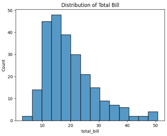
Output Explanation
X-axis → Total Bill values
Y-axis → Frequency
Bars → Count of values in each interval
If most bars are in middle → Data is centered.
If bars stretch more on right → Right skewed.Bins Concept
What are Bins?
Bins are intervals that group numeric values.
Example:
If total_bill ranges from 0 to 50
Bins = 5Then intervals may be:
0–10
10–20
20–30
30–40
40–50Control Number of Bins
Histogram with 5 Bins
This visualization displays the distribution of total bill amounts using a histogram with a controlled number of bins (bins=5).
sns.histplot(x="total_bill", data=tips, bins=5)
plt.title("Histogram with 5 Bins")
plt.show()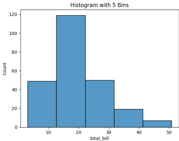
Effect of Bins
Choosing correct bin size is important.
Frequency vs Density
Frequency (Default)
Shows count of values in each bin.
sns.histplot(x="total_bill", data=tips)
Y-axis → Count
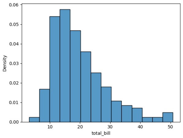
Density
Shows probability distribution instead of count.
sns.histplot(x="total_bill", data=tips, stat="density")
Y-axis → Density
Total area under curve = 1
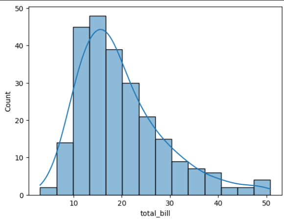
Add KDE Curve
sns.histplot(x="total_bill", data=tips, kde=True)- KDE = Smooth density curve over histogram.
Difference Table
Using Hue (Multiple Distributions)
Why Use Hue?
To compare distributions of two categories.
Example:
Male vs Female spending
Smoker vs Non-Smoker
Example
Total Bill Distribution by Gender (Histogram with KDE)
This visualization shows the distribution of total bill amounts separated by gender using a histogram with a Kernel Density Estimate (KDE) curve.
sns.histplot(x="total_bill",
            hue="sex",
            data=tips,
            kde=True)
plt.title("Total Bill Distribution by Gender")
plt.show()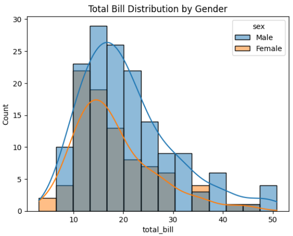
Output Explanation
Different colors → Male & Female
Compare:
Distribution shape
Skewness
Spread
Which group spends more
Stacked Histogram
sns.histplot(x="total_bill",
            hue="sex",
            data=tips,
            multiple="stack")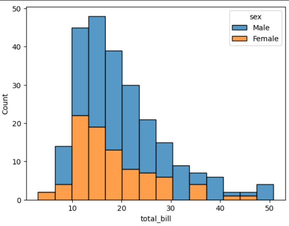
Options:
layer (default)
stack
dodge
fill