Scatter Plot
-
This module teaches how to create and customize scatter plots in Matplotlib using
plt.scatter(). You will learn about marker styles, color mapping, size variation, and adding grid to improve data visualization clarity.
Scatter Plot
Shows relationship between two variables.
Use Case:
Experience vs Salary
Marketing spend vs Sales
With Pyplot, you can use the scatter() function to draw a scatter plot.
The scatter() function plots one dot for each observation. It needs two arrays of the same length, one for the values of the x-axis, and one for values on the y-axis:
Basic Scatter Plot for Relationship Analysis
This code creates a scatter plot using Matplotlib to show the relationship between two numerical variables (x and y).
import matplotlib.pyplot as plt
import numpy as np
x = np.array([5,7,8,7,2,17,2,9,4,11,12,9,6])
y = np.array([99,86,87,88,111,86,103,87,94,78,77,85,86])
plt.scatter(x, y)
plt.show()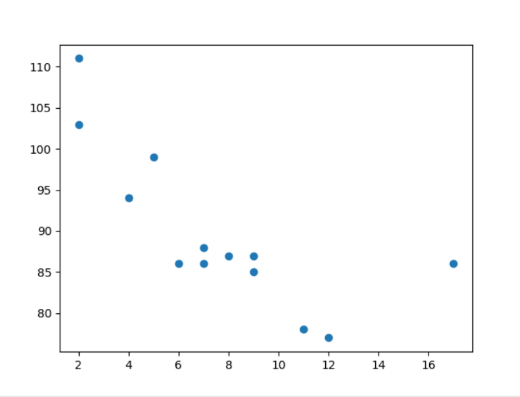
The observation in the example above is the result of 13 cars passing by.
The X-axis shows how old the car is.
The Y-axis shows the speed of the car when it passes.
Are there any relationships between the observations?
It seems that the newer the car, the faster it drives, but that could be a coincidence, after all we only registered 13 cars.
Compare Plots
In the example above, there seems to be a relationship between speed and age, but what if we plot the observations from another day as well? Will the scatter plot tell us something else?
Scatter Plot Comparison for Two Different Days
This code creates two scatter plots on the same graph to compare data from two different days. Each dataset represents the relationship between car age (x) and speed (y).
import matplotlib.pyplot as plt
import numpy as np

#day one, the age and speed of 13 cars:
x = np.array([5,7,8,7,2,17,2,9,4,11,12,9,6])
y = np.array([99,86,87,88,111,86,103,87,94,78,77,85,86])
plt.scatter(x, y)

#day two, the age and speed of 15 cars:
x = np.array([2,2,8,1,15,8,12,9,7,3,11,4,7,14,12])
y = np.array([100,105,84,105,90,99,90,95,94,100,79,112,91,80,85])
plt.scatter(x, y)

plt.show()
Colors
You can set your own color for each scatter plot with the color or the c argument:
Multiple Scatter Plots with Different Colors
This code creates two scatter plots on the same graph and assigns different colors to each dataset using the color parameter.
import matplotlib.pyplot as plt
import numpy as np

x = np.array([5,7,8,7,2,17,2,9,4,11,12,9,6])
y = np.array([99,86,87,88,111,86,103,87,94,78,77,85,86])
plt.scatter(x, y, color = 'hotpink')

x = np.array([2,2,8,1,15,8,12,9,7,3,11,4,7,14,12])
y = np.array([100,105,84,105,90,99,90,95,94,100,79,112,91,80,85])
plt.scatter(x, y, color = '#88c999')

plt.show()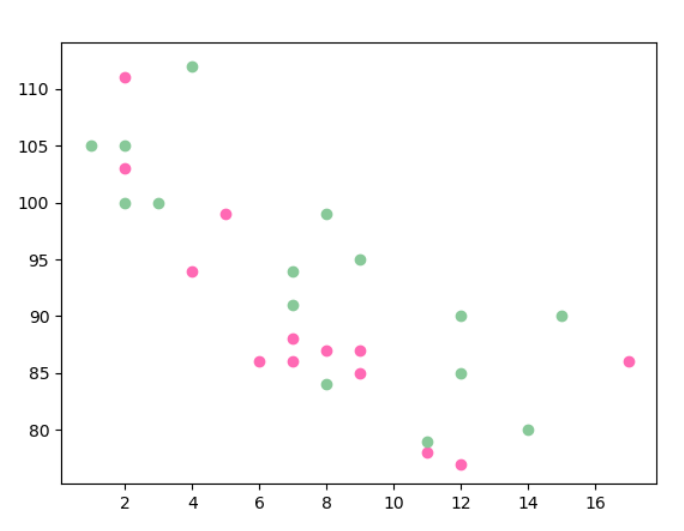
ColorMap
The Matplotlib module has a number of available colormaps.
A colormap is like a list of colors, where each color has a value that ranges from 0 to 100.
Here is an example of a colormap:

Scatter Plot with Color Mapping (Colormap Visualization)
This code creates a scatter plot where each point’s color is determined by a numeric value using a colormap.
import matplotlib.pyplot as plt
import numpy as np
x = np.array([5,7,8,7,2,17,2,9,4,11,12,9,6])
y = np.array([99,86,87,88,111,86,103,87,94,78,77,85,86])
colors = np.array([0, 10, 20, 30, 40, 45, 50, 55, 60, 70, 80, 90, 100])
plt.scatter(x, y, c=colors, cmap='viridis')
plt.colorbar()
plt.show()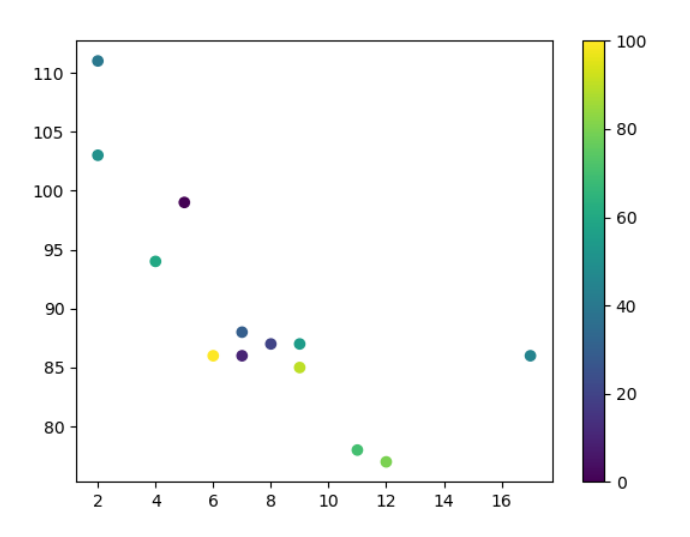
Available ColorMaps
You can choose any of the built-in colormaps:
Size
You can change the size of the dots with the s argument.
Just like colors, make sure the array for sizes has the same length as the arrays for the x- and y-axis:
Example:
Scatter Plot with Custom Marker Sizes (Bubble Effect)
This code creates a scatter plot where each data point has a different size using the s parameter.
import matplotlib.pyplot as plt
import numpy as np
x = np.array([5,7,8,7,2,17,2,9,4,11,12,9,6])
y = np.array([99,86,87,88,111,86,103,87,94,78,77,85,86])
sizes = np.array([20,50,100,200,500,1000,60,90,10,300,600,800,75])
plt.scatter(x, y, s=sizes)
plt.show()
Alpha
You can adjust the transparency of the dots with the alpha argument.
Just like colors, make sure the array for sizes has the same length as the arrays for the x- and y-axis:
Combine Color Size and Alpha
You can combine a colormap with different sizes of the dots. This is best visualized if the dots are transparent:
Bubble Scatter Plot with Colormap and Transparency
This code generates a dynamic scatter plot using randomly created data and visualizes four dimensions of information.
import matplotlib.pyplot as plt
import numpy as np
x = np.random.randint(100, size=(100))
y = np.random.randint(100, size=(100))
colors = np.random.randint(100, size=(100))
sizes = 10 * np.random.randint(100, size=(100))
plt.scatter(x, y, c=colors, s=sizes, alpha=0.5, cmap='nipy_spectral')
plt.colorbar()
plt.show()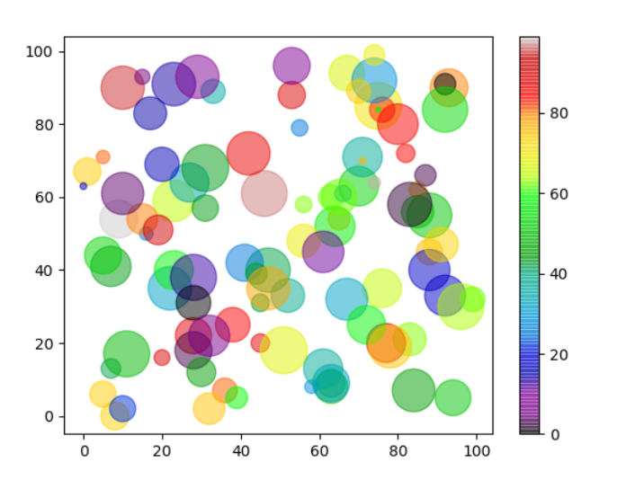
Scatter Plot with Grid
In Matplotlib, you can create a scatter plot using plt.scatter() and enable grid using plt.grid().
Basic Example
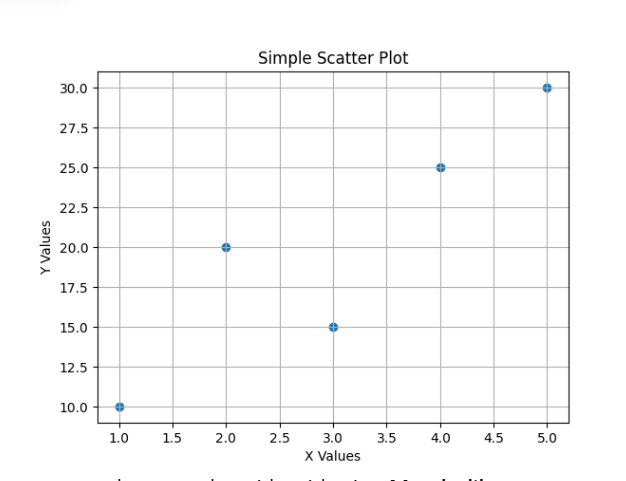
Simple Scatter Plot with Grid, Title, and Axis Labels
This code creates a basic scatter plot and enhances it with a grid, title, and axis labels for better readability.
import matplotlib.pyplot as plt
# Sample Data
x = [1, 2, 3, 4, 5]
y = [10, 20, 15, 25, 30]
# Create Scatter Plot
plt.scatter(x, y)
# Add Grid
plt.grid(True)
# Titles and Labels
plt.title("Simple Scatter Plot")
plt.xlabel("X Values")
plt.ylabel("Y Values")
# Show Plot
plt.show()
Explanation
plt.scatter(x, y) → Scatter plot banata hai
plt.grid(True) → Graph me grid lines show karta hai
plt.title() → Graph ka title
plt.xlabel() / plt.ylabel() → Axis labels