Swarm Plot
- This module teaches how to create swarm plots in Seaborn to visualize non-overlapping individual data points. You will learn how swarm plots improve category comparison and how they differ from strip plots in Python.
What is a Swarm Plot?
A Swarm Plot is similar to a Strip Plot but:
Shows individual data points
Avoids overlapping automatically
Provides clear category-wise distributionIt is also called a beeswarm plot.
Non-overlapping Data Points
Theory
In Strip Plot:
Points may overlap
Jitter spreads points randomly
In Swarm Plot:
Points are arranged automatically
No overlapping
More accurate distribution view
It uses an algorithm to adjust point positions.
Example Code
Swarm Plot – Total Bill by Day
This visualization uses a swarm plot to display individual total bill values for each day of the week.
import seaborn as sns
import matplotlib.pyplot as plt

tips = sns.load_dataset("tips")

sns.swarmplot(x="day", y="total_bill", data=tips)
plt.title("Swarm Plot - Total Bill by Day")
plt.show()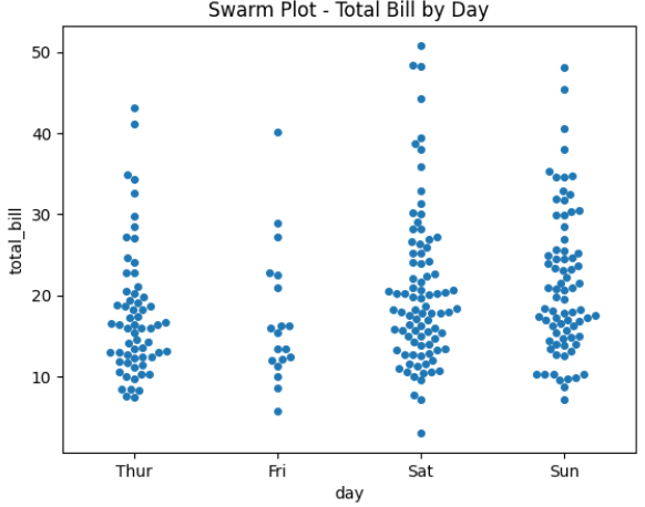
Output Explanation
X-axis → Day
Y-axis → Total Bill
Each dot → One observation
No dots overlap
You can clearly see:
Spread of values
Clusters
Outliers
Better Category Visualization
Why Better?
Swarm plot provides:
Clear distribution shape
Easy comparison between categories
Better readability than strip plotEspecially useful when dataset is small to medium.
Example — Category Comparison
Swarm Plot with Gender Comparison
This visualization uses a swarm plot to compare total bill amounts across different days, separated by gender.
sns.swarmplot(x="day", y="total_bill", hue="sex", data=tips)
plt.title("Swarm Plot with Gender Comparison")
plt.show()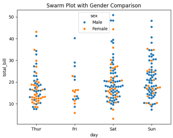
Output Explanation
Different colors → Male vs Female
Compare:
Which group spends more
Spread difference
Outliers
Each category shows real, non-overlapping points.
Combining with Box Plot
Very powerful visualization:
Boxplot + Swarm Plot (Combined Visualization)
This powerful visualization combines a box plot and a swarm plot to present both statistical summary and individual data points for total bills across different days.
sns.boxplot(x="day", y="total_bill", data=tips)
sns.swarmplot(x="day", y="total_bill", data=tips, color="black")
plt.title("Boxplot + Swarm Plot")
plt.show()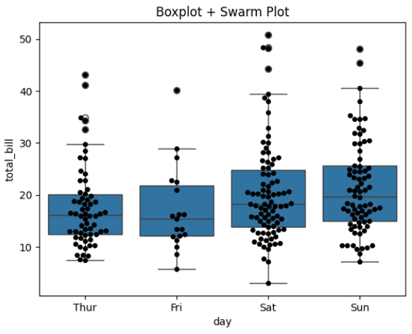
Why Combine?
Box plot → Statistical summary
Swarm plot → Individual observations
Best for presentations & business reports.
Comparison with Strip Plot
Custom Styling
Horizontal Swarm Plot
sns.swarmplot(y="day", x="total_bill", data=tips)Adjust Size
sns.swarmplot(x="day", y="total_bill", data=tips, size=6)Change Color
sns.swarmplot(x="day", y="total_bill", data=tips, palette="Set2")