Bar Plot
- This module teaches how to create bar plots in Seaborn for categorical data. You will learn about mean aggregation, using hue for grouping, and changing the orientation of bars to enhance data visualization clarity in Python.
Categorical Data Visualization
Theory
Bar plots are used when:
X-axis = Category (like product, day, city)
Y-axis = Numerical value (sales, marks, revenue)
Comparison between categories
Seaborn automatically:
Calculates mean
Shows confidence interval
Basic Bar Plot Example
Average Total Bill per Day – Bar Plot
This code creates a bar plot using Seaborn to visualize the average total bill amount for each day of the week from the tips dataset.
import seaborn as sns
import matplotlib.pyplot as plt

# Load dataset
df = sns.load_dataset("tips")

# Basic Bar Plot
sns.barplot(x="day", y="total_bill", data=df)

plt.title("Average Total Bill per Day")
plt.show()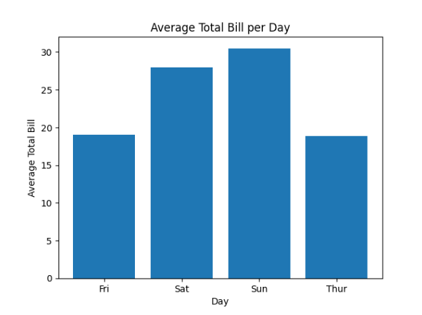
Explanation:
x="day" → Categorical variable
y="total_bill" → Numerical variable
Automatically calculates mean
Mean & Aggregation
Theory
By default:
Seaborn calculates mean
Shows confidence interval
You can change aggregation using estimator.
Example – Using Median
Median Total Bill per Day – Bar Plot
This code creates a bar plot using Seaborn where the median total bill is calculated for each day instead of the default mean.
import numpy as np

sns.barplot(x="day", y="total_bill", data=df, estimator=np.median)

plt.title("Median Total Bill per Day")
plt.show()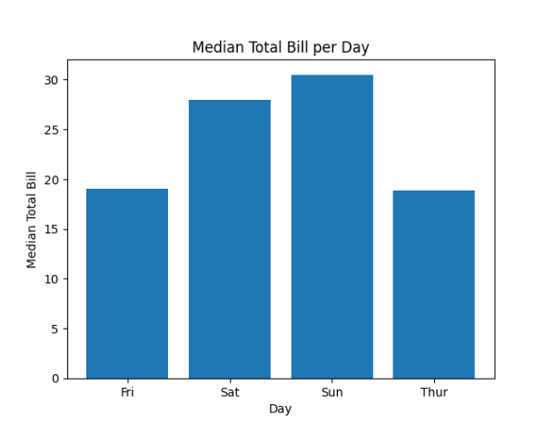
Using hue
Theory
hue adds another categorical variable.
Used for:
Gender comparison
Product category comparison
Year comparison
Example
Total Bill per Day – Comparison by Gender
This code creates a grouped bar plot using Seaborn to compare total bill amounts per day for male and female customers.
sns.barplot(x="day", y="total_bill", hue="sex", data=df)

plt.title("Total Bill per Day (Male vs Female)")
plt.show()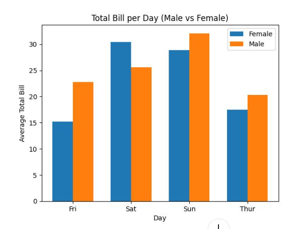
Orientation Change
Theory
Default orientation = Vertical
To make horizontal:
Swap x and y
Useful when:
Category names are long
Better readability needed
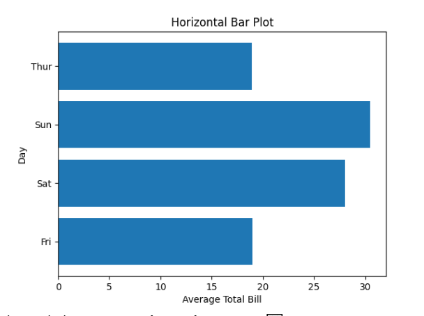
Horizontal Bar Plot
Average Total Bill per Day – Horizontal Bar Plot
This code creates a horizontal bar plot using Seaborn, which is useful when category names are long or for better readability.
sns.barplot(y="day", x="total_bill", data=df)

plt.title("Horizontal Bar Plot")
plt.show()