Count Plot
- This module teaches how to create count plots in Seaborn for visualizing frequency counts. You will learn to compare single or multiple categories, helping you analyze categorical data effectively in Python.
What is a Count Plot?
A Count Plot is used to show the frequency (count) of observations in each category of a categorical variable.
It is mainly used in Exploratory Data Analysis (EDA) to understand:
How many times each category appears
Which category is most common
Comparison between categories
In Python, we use:
Seaborn
Built on top of Matplotlib
Frequency Count Visualization
Theory
A count plot:
Displays number of occurrences
Works only with categorical variables
Automatically counts data (no need to calculate manually)
Syntax
Count of Categories – Basic Count Plot
This code creates a count plot using Seaborn to show the frequency of each category in a column.
import seaborn as sns
import matplotlib.pyplot as plt

sns.countplot(x="column_name", data=df)
plt.show()
Basic Count Plot
Dataset Example:
Code
Count of Male and Female Customers – Count Plot
This code creates a count plot using Seaborn to visualize the number of male and female customers in the tips dataset.
import seaborn as sns
import matplotlib.pyplot as plt

tips = sns.load_dataset("tips")

sns.countplot(x="sex", data=tips)
plt.title("Count of Gender")
plt.show()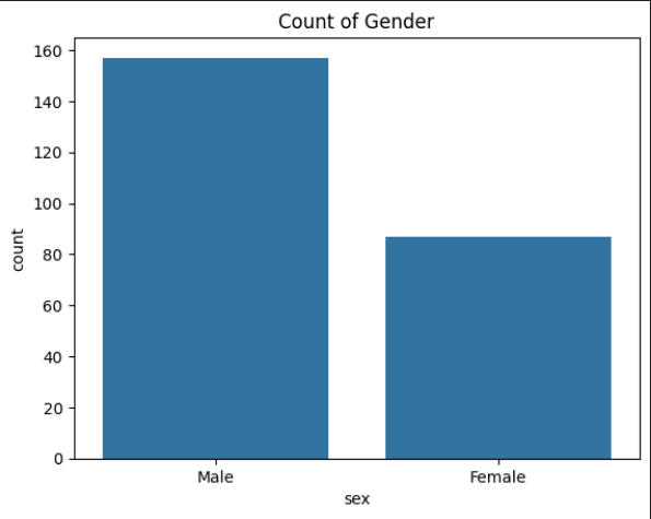
Category Comparison
Theory
We use count plot to compare:
Gender distribution
Product category sales count
Department-wise employees
City-wise customers
It helps to visually compare category sizes.
Exmaple: Comparing Days
Customer Visits Per Day – Count Plot
This code creates a count plot using Seaborn to show the number of customer visits for each day of the week from the tips dataset.
sns.countplot(x="day", data=tips)
plt.title("Customer Visits Per Day")
plt.show()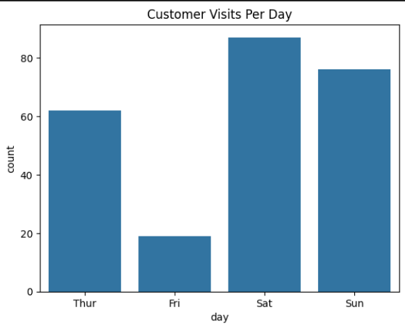
Output Explanation:
Shows number of customers on:
Thur
Fri
Sat
Sun
If Saturday bar is tallest → Most customers came on Saturday.
Using Multiple Categories (Hue Parameter)
Theory
We use hue parameter to:
Compare sub-categories
Add another categorical variable
Create grouped bars
Syntax
sns.countplot(x="column1", hue="column2", data=df)
Example: Gender Distribution Per Day
Gender Distribution Per Day – Count Plot
This code creates a grouped count plot using Seaborn to visualize the number of male and female customers visiting the restaurant each day.
sns.countplot(x="day", hue="sex", data=tips)
plt.title("Gender Distribution Per Day")
plt.show()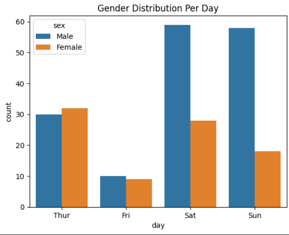
Output Explanation
X-axis → Days
Y-axis → Count
Different colors → Male vs Female
Helps compare:
Which gender visited more on each day
Example Insight:
On Saturday → Males > Females
On Sunday → Almost equal
Horizontal Count Plot
Customer Visits Per Day – Horizontal Count Plot
This code creates a horizontal count plot using Seaborn to visualize the number of customer visits for each day of the week.
sns.countplot(y="day", data=tips)
plt.title("Horizontal Count Plot")
plt.show()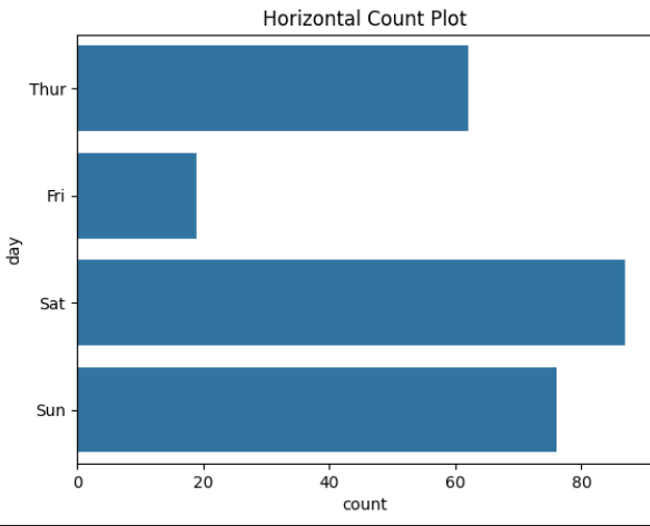
Why use horizontal?
When category names are long
Better readability
Customizing Count Plot
Adding Color
sns.countplot(x="day", data=tips, palette="Set2")- Sorting Categories
sns.countplot(x="day", data=tips, order=tips["day"].value_counts().index)