Pair Plot & PairGrid
- This module teaches how to create pair plots and PairGrids in Seaborn for detailed pairwise relationship analysis. You will learn multi-variable comparison, using hue, diagonal customization, custom pairwise plotting, and advanced mapping techniques for deeper insights in Python.
What is Pair Plot?
Theory
A Pair Plot:
✔ Shows pairwise relationships between numerical variables
✔ Displays scatter plots for variable combinations
✔ Shows distribution on diagonal
✔ Useful for correlation detectionIt is created using:
sns.pairplot()
Pairwise Relationship Analysis
Example
Pairwise Relationship Analysis (Pair Plot)
This visualization uses Seaborn’s pairplot to show pairwise relationships between all numerical variables in the dataset.
import seaborn as sns
import matplotlib.pyplot as plt

tips = sns.load_dataset("tips")

sns.pairplot(tips)
plt.show()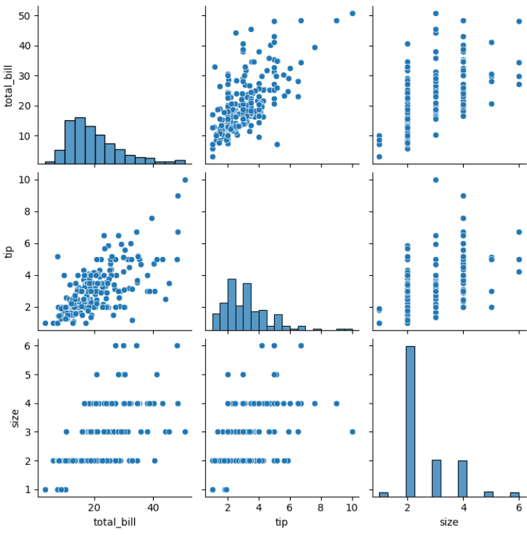
Output Explanation
If dataset has 4 numeric columns:
You get a 4x4 grid:
Diagonal → Distribution plots
Off-diagonal → Scatter plots
Shows relationship between every pair of variables
You can analyze:
✔ Positive correlation
✔ Negative correlation
✔ No relationship
✔ ClustersMulti-variable Comparison
Pairplot automatically compares:
total_bill vs tip
total_bill vs size
tip vs size
etc.
This gives complete overview of numerical data.
Using Hue
Why Hue?
To visualize category differences.
Example
Pair Plot with Hue (Category Differences by Gender)
This visualization uses Seaborn’s pairplot with the hue parameter to explore pairwise relationships while distinguishing categories.
sns.pairplot(tips, hue="sex")
plt.show()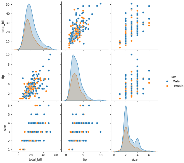
Output Explanation
Different colors for Male & Female
See if relationship differs by gender
Observe clustering patterns
You can also use:
sns.pairplot(tips, hue="smoker")Diagonal Options
By default, diagonal shows histogram.
You can change it.
Histogram (Default)
sns.pairplot(tips, diag_kind="hist")KDE on Diagonal
sns.pairplot(tips, diag_kind="kde")KDE gives smoother distribution view.
Custom Pairwise Plotting (kind Parameter)
You can control scatter type.
Scatter (Default)
sns.pairplot(tips, kind="scatter")Regression Line
sns.pairplot(tips, kind="reg")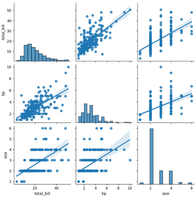
Adds regression line in scatter plots.
Useful for:
Trend analysis
Correlation strength
What is PairGrid?
Theory
PairGrid is advanced version of pairplot.
Pairplot internally uses PairGrid.
Advanced Custom Mapping (PairGrid)
Basic Structure
Advanced Pairwise Analysis using PairGrid
This visualization uses Seaborn’s PairGrid for customized pairwise plotting.
g = sns.PairGrid(tips)
g.map(sns.scatterplot)
plt.show()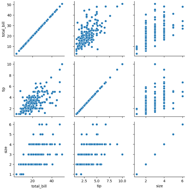
Different Plots for Upper, Lower, Diagonal
This is where PairGrid becomes powerful.
Example
Custom PairGrid with Different Plots on Upper, Lower, and Diagonal
This visualization demonstrates the power of Seaborn’s PairGrid by using different plots for different parts of the grid.
g = sns.PairGrid(tips)

g.map_upper(sns.scatterplot)
g.map_lower(sns.kdeplot)
g.map_diag(sns.histplot)

plt.show()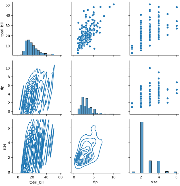
Output Explanation
Upper triangle → Scatter
Lower triangle → KDE
Diagonal → Histogram
This creates a fully customized pairwise visualization.
Using Hue in PairGrid
Custom PairGrid with Hue (Gender Comparison)
This visualization uses Seaborn’s PairGrid with the hue parameter to incorporate categorical differences into advanced pairwise analysis.
g = sns.PairGrid(tips, hue="sex")

g.map_upper(sns.scatterplot)
g.map_lower(sns.kdeplot)
g.map_diag(sns.histplot)

g.add_legend()
plt.show()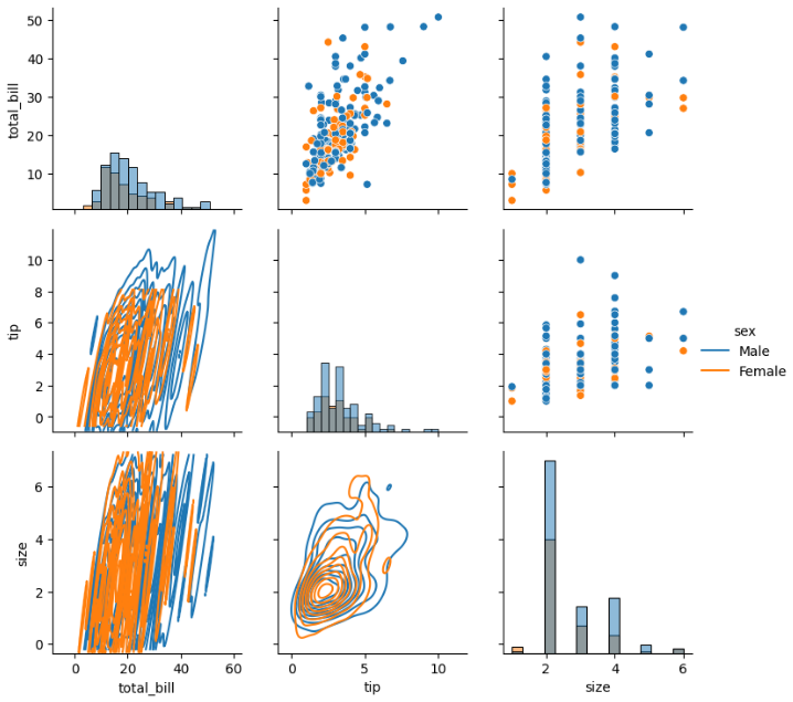
Now categories are color-coded.