Relational Plot
-
This module teaches how to create relational plots in Seaborn for multi-variable visualization. You will learn to use
hue,style, andsizeparameters, switch between scatter and line modes, and utilize Facet Grid for structured comparison in Python.
What is a Relational Plot?
Theory
A Relational Plot is used to:
✔ Visualize relationship between two numerical variables
✔ Add multiple dimensions (color, size, style)
✔ Create Scatter or Line plots
✔ Support Facet GridIt is mainly used for:
Trend analysis
Correlation visualization
Multi-variable analysis
Multi-variable Visualization
Why Use relplot()?
Basic scatter plot shows:
X variable
Y variable
But relplot allows adding:
hue → category color
size → numeric scaling
style → marker style
row / col → facet grid
Basic Example (Scatter Mode)
Relationship between Total Bill and Tip (Relational Plot)
This visualization uses Seaborn’s relplot to display the relationship between total bill amounts and tips.
import seaborn as sns
import matplotlib.pyplot as plt

tips = sns.load_dataset("tips")

sns.relplot(x="total_bill", y="tip", data=tips)
plt.show()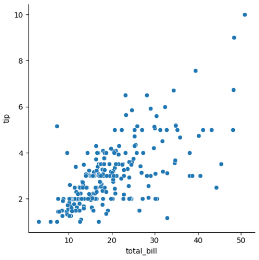
Output Explanation
X-axis → total_bill
Y-axis → tip
Each point → One observation
You can analyze:
✔ Positive relationship
✔ Negative relationship
✔ No relationshiphue, style, size Parameters
hue Parameter
Adds color based on category.
Total Bill vs Tip Colored by Gender (Relational Plot with Hue)
This visualization uses Seaborn’s relplot with the hue parameter to show the relationship between total bill and tip, separated by gender.
sns.relplot(x="total_bill",
           y="tip",
           hue="sex",
           data=tips)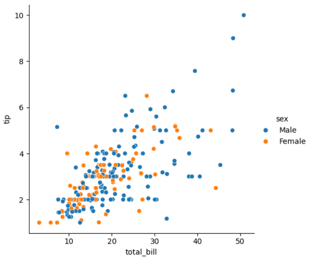
Different colors for Male & Female.
size Parameter
Changes marker size based on numeric variable.
Total Bill vs Tip (Bubble Plot with Size Parameter)
This visualization uses Seaborn’s relplot with the size parameter to show the relationship between total bill and tip, where the marker size represents the number of people (size column).
sns.relplot(x="total_bill",
           y="tip",
           size="size",
           data=tips)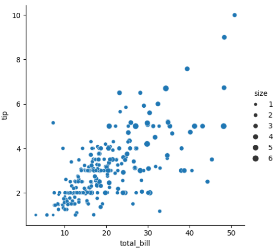
Bigger marker = Larger group size.
style Parameter
Changes marker style based on category.
Total Bill vs Tip (Marker Style by Smoking Status)
This visualization uses Seaborn’s relplot with the style parameter to change marker shapes based on the smoking status of customers.
sns.relplot(x="total_bill",
           y="tip",
           style="smoker",
           data=tips)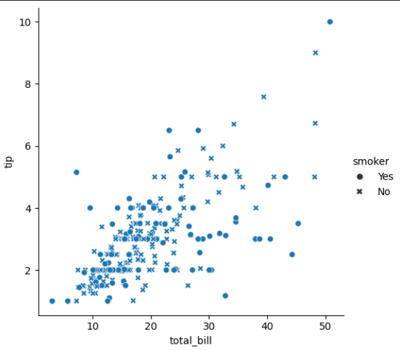
Different shapes for Smoker & Non-Smoker.
Combine All Together
Multi-Variable Scatter Plot (Total Bill vs Tip)
This visualization combines multiple dimensions in a Seaborn relplot: x="total_bill" → Total bill on X-axis y="tip" → Tip amount on Y-axis hue="sex" → Color differentiates Male and Female customers style="smoker" → Marker shape indicates Smoker vs Non-Smoker size="size" → Marker size represents the number of people in the party
sns.relplot(x="total_bill",
           y="tip",
           hue="sex",
           style="smoker",
           size="size",
           data=tips)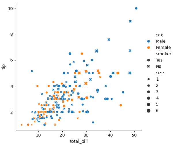
This creates multi-dimensional visualization.
Scatter vs Line Mode
Relplot supports two modes:
Scatter Mode (Default)
Total Bill vs Tip (Scatter Plot)
This visualization uses Seaborn’s relplot in scatter mode (default) to show the relationship between total bill and tip amounts.
sns.relplot(x="total_bill",
           y="tip",
           kind="scatter",
           data=tips)
Used for:
Correlation
Clusters
Distribution
Line Mode
Total Bill Trend by Day (Line Plot)
This visualization uses Seaborn’s relplot in line mode to show the trend of total bill amounts across different days of the week.
sns.relplot(x="day",
           y="total_bill",
           kind="line",
           data=tips)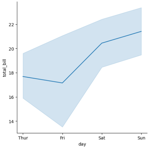
Used for:
Trend analysis
Time series data
Line Mode with Hue
Total Bill Trend by Day and Gender (Line Plot with Hue)
This visualization uses Seaborn’s relplot in line mode with the hue parameter to show total bill trends across days, separated by gender.
sns.relplot(x="day",
           y="total_bill",
           hue="sex",
           kind="line",
           data=tips)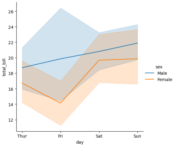
Compare trends by category.
Facet Grid Support
Relplot supports:
row
col
For creating multiple subplots.
Example — Column Facet
Total Bill vs Tip by Gender (Column Facet)
This visualization uses Seaborn’s relplot with the col parameter to create separate scatter plots for each gender.
sns.relplot(x="total_bill",
           y="tip",
           col="sex",
           data=tips)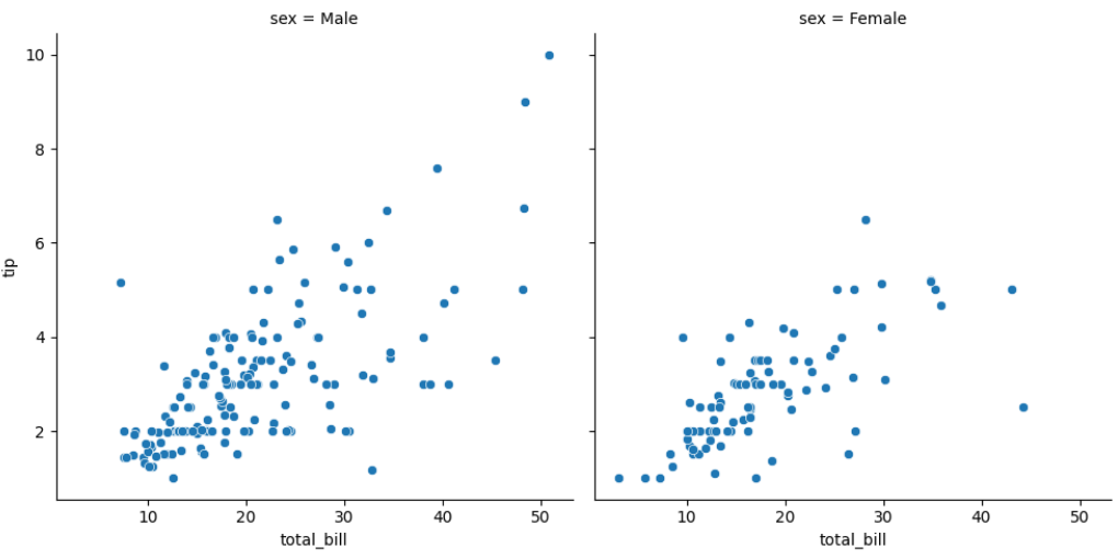
Separate scatter plots for:
Male
Female
Example — Row + Column
Total Bill vs Tip by Gender and Smoking Status (Facet Grid)
This visualization uses Seaborn’s relplot with both row and col parameters to create a grid of scatter plots:
sns.relplot(x="total_bill",
           y="tip",
           row="smoker",
           col="sex",
           data=tips)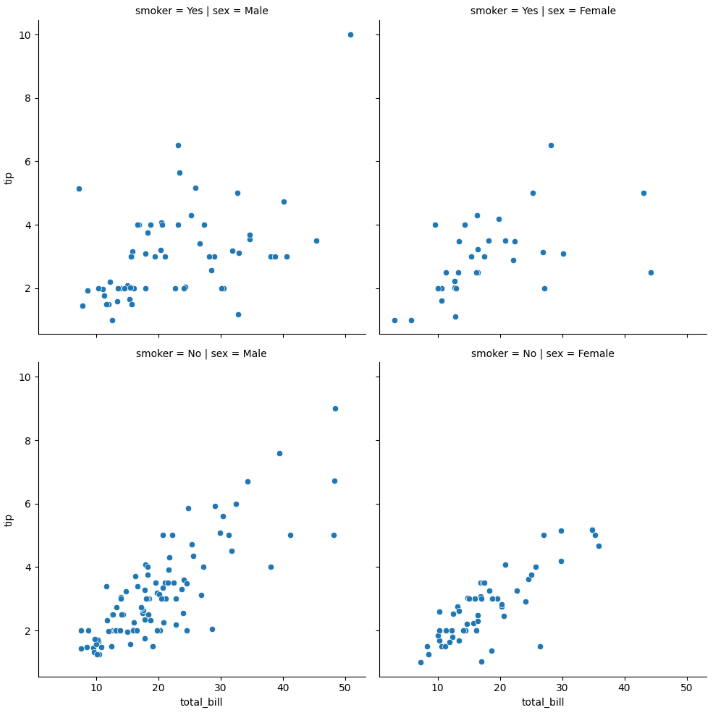
Creates grid:
Male Smoker
Male Non-Smoker
Female Smoker
Female Non-Smoker
This is powerful for multi-category analysis.