Threshold & Probability-Based Metrics
- Threshold and probability-based metrics evaluate classification models based on prediction probabilities and decision thresholds.
Decision Threshold
Most classifiers output probabilities of belonging to each class.
Decision threshold determines the cutoff for predicting a positive class.
Example: Logistic Regression
Probability ≥ 0.5 → Predict 1 (Positive)
Probability < 0.5 → Predict 0 (Negative)
Adjusting Threshold:
Increase threshold → Higher Precision, Lower Recall
Decrease threshold → Higher Recall, Lower Precision
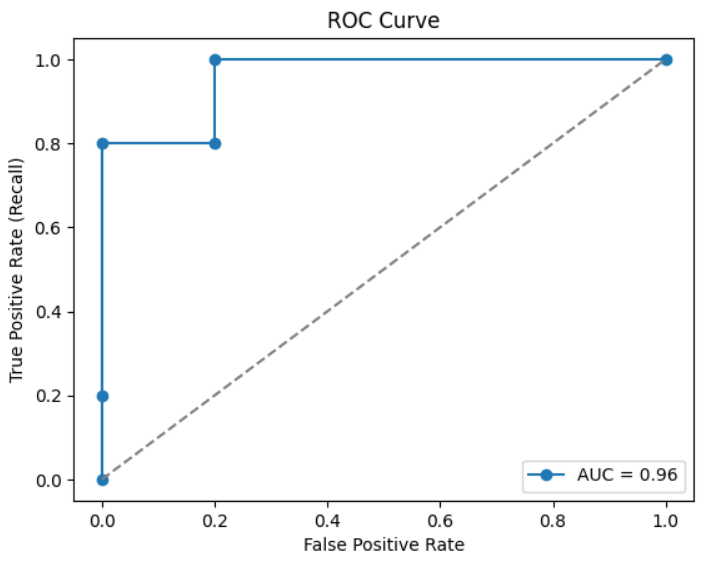
ROC Curve (Receiver Operating Characteristic Curve)
Plots True Positive Rate (Recall) vs False Positive Rate (FPR) at different thresholds.
FPR=FPFP+TN,TPR=TPTP+FNFPR = \frac{FP}{FP + TN}, \quad TPR = \frac{TP}{TP + FN}FPR=FP+TNFP,TPR=TP+FNTP
X-axis: False Positive Rate (FPR)
Y-axis: True Positive Rate (Recall)
Shows tradeoff between sensitivity and specificity
Interpretation:
Curve close to top-left corner → better model
Diagonal line → random guessing
AUC (Area Under Curve)
AUC measures the overall ability of the model to distinguish between classes.
Higher AUC → better model
Why Threshold & ROC Matter
Different thresholds change predictions → affect Precision, Recall, F1.
ROC + AUC help to choose an optimal threshold without being biased to a single metric.
Python Example: ROC & AUC
ROC Curve and AUC Score Example in Python for Model Evaluation
This Python example demonstrates how to evaluate a classification model using the ROC (Receiver Operating Characteristic) Curve and AUC (Area Under the Curve) Score. The code compares actual labels with predicted probabilities, computes the false positive rate and true positive rate, calculates the AUC score, and visualizes the ROC curve using Matplotlib to measure the model’s classification performance.
# Step 1: Import Libraries
from sklearn.metrics import roc_curve, roc_auc_score
import matplotlib.pyplot as plt
import numpy as np

# Step 2: Actual vs Predicted Probabilities
y_true = np.array([0, 0, 1, 1, 1, 0, 1, 0, 1, 0])
y_scores = np.array([0.1, 0.4, 0.35, 0.8, 0.9, 0.2, 0.75, 0.3, 0.85, 0.05])

# Step 3: Compute ROC Curve
fpr, tpr, thresholds = roc_curve(y_true, y_scores)

# Step 4: Compute AUC
auc_score = roc_auc_score(y_true, y_scores)
print("AUC Score:", auc_score)

# Step 5: Plot ROC Curve
plt.plot(fpr, tpr, marker='o', label=f'AUC = {auc_score:.2f}')
plt.plot([0,1], [0,1], linestyle='--', color='grey')  # random line
plt.xlabel("False Positive Rate")
plt.ylabel("True Positive Rate (Recall)")
plt.title("ROC Curve")
plt.legend()
plt.show()
Output: